Showing posts sorted by relevance for query life studies. Sort by date Show all posts

Saturday 21 May 2011

Happy Birthday Frank - More life studies

Life study (Thanks to Paul Vyse)


If you click on this previous post's link, you'll see a few life studies. I have been fortunate to receive a few photos by kind people of their copies of life studies, so thought I'd add to the blog for all to see. And especially as today would have been Frank's 94th birthday and I have a suspicion he enjoyed this part of his work! My thoughts are with Nancy his widow (who will be 89 herself this August) as I'm sure she'll remember today. She's been unwell recently, and a few fans have been visiting and reporting back  We wish you well Nancy.

Life study (Thanks to Paul Vyse)


The two studies were sent to me by Paul Vyse who also owns a Radio Times piece - very beautiful - coming up in a later blog entry. If you're following the reprints of Garth in the Daily Mirror you'll be seeing how Bellamy used his experience of life studies! I must say again that I am enjoying following the newly coloured adventures day by day. The reproduction of Martin Baines' colouring, has certainly got better! Although John Ridgway's colouring is printed on superior paper in Spaceship Away, I also enjoy having newsprint in my hands

The following studies were sent to me after I contacted  Peter Labrow (Author of The Well), as he mentioned on Twitter that he owned a couple of pieces. Peter has an interesting Kindle production on Amazon UK  or Amazon US and can be contacted via his website

Interestingly the first one below (the model holding a chair back),  has a name on the reverse "The model's name is on the back of this one - Angela Mansi - as is the date 22/2/65" which is useful as this confirms that Bellamy was participating in life classes at the Studio Club in Piccadilly at that time.

Thanks to Peter Labrow


Many thanks again top Paul and Peter

Friday 14 August 2020

ORIGINAL ART: Various from Comic Book Auctions - Thunderbirds, Life Study, Garths and Sunday Times

Angela Mansi

This lovely nude or 'life study' (as I call them to avoid censorship), is currently appearing on Comic Book Auctions and The Saleroom

I've added the individual links below for Lots #67, 68, 79, 82 and 85 which are original art pieces by Frank Bellamy, so let's go through them and preserve them here for posterity (or as long as this website lives!)


The first is a rather faded Thunderbirds double page - from the second Thunderbird story in TV21 #64

"Thunderbirds" from TV21 #64

This piece is described:
Thunderbirds original double-page artwork drawn, painted and signed by Frank Bellamy from TV Century 21 No 64 (1966). Virgil jumps for his life as the International Rescue Machine is charged by the crazed rhinoceros… Some minor fading to the Pelikan inks. 27 x 19 ins.
This is certainly very collectable, being such an early story and also a double page spread. These first few stories are cherished by fans and this one shows Bellamy's love of Africa.
 
 
The second lot is of the nude above and has this description:
Angela Mansi nude study drawn and signed by Frank Bellamy (mid 60s). During this time Frank Bellamy ran and organised life drawing classes at the Studio Club in London's Piccadilly. From the Bob Monkhouse Archive. Brown crayon on paper. 17 x 10 ins. No Reserve

If you search the blog for 'life studies' you'll find others that I've shown. It'll be interesting to see what price this fetches.

"Discreditable exercise" Sunday Times 6 December 1970

The third lot is from the Sunday Times Colour Magazine (6 December 1970) and was written by Robert Lacey, the British historian and writer. I've communicated with Robert over this series and have captured his memories for use on this blog in the future. This piece appeared on pages 22-23 and is all about credit checking. It's described thus:

A Discreditable Exercise' original double-page artwork painted and signed by Frank Bellamy for The Sunday Times magazine (late 1960s). From the Bob Monkhouse Archive. Bright Pelikan inks on board. 28 x 20 ins. No Reserve

This is the sort of design layout that made me fall in love with Bellamy (despite having seen his work from circa 1963 in Eagle, TV21 amongst others). Where and how he places panels is superb - and remember - this is way before any comic strips were standard in the relatively 'new' glossy Sunday magazines, let alone such a quality paper as the Times was!
 

The next two lots are Garth strips

Garth: "Beast of Ultor"H108-H109

The first pair are lovely- the hands depicting the Harpies attack have that three-dimensional look and we have the Bellamy 'swirls' as I call them.  But not only that, this strip shows the recurring character in the Garth strip - Astra.

The auction description:

Garth: The Beast of Ultor. 2 original consecutive artworks (1974) drawn and signed by Frank Bellamy for the Daily Mirror 9-10 May 1974. Indian ink on board. 21 x 7 ins (x2)


Garth: "The Bride of Jenghiz Khan" H265-H266

Both these show how Bellamy depicts three-dimensions in two so effectively in a comic strip with three panels. The description:

Garth: Bride of Jenghiz Khan. 2 original consecutive artworks (1974) drawn and signed by Frank Bellamy for the Daily Mirror 11-12 November 1974. Indian ink on board. 21 x 7 ins (x2)

Both pairs of artwork are lovely and it's great to get consecutive numbering.  As usual I'll update the details below when the auctions are finished

AUCTION SUMMARY

THUNDERBIRDS in TV21 #64
WHERE?: Comic Book Auctions
STARTING BID: £1,620
Auctioneer's estimate
£1,800 - £2,400

ENDING PRICE: £2,250
END DATE: 30 August 2020

ANGELA MANSI LIFE STUDY
WHERE?: Comic Book Auctions
STARTING BID: £1
ENDING PRICE: £125
END DATE: 30 August 2020

SUNDAY TIMES: "A DISCREDITABLE EXERCISE"
WHERE?: Comic Book Auctions
STARTING BID: £1
ENDING PRICE: £1,900
END DATE: 30 August 2020

GARTH: H108 + H109
WHERE?: Comic Book Auctions
STARTING BID: £450
Auctioneer's estimate
£500- £600
ENDING PRICE: £640
END DATE: 30 August 2020

GARTH: H265+H266
WHERE?: Comic Book Auctions
STARTING BID: £450
Auctioneer's estimate
£500- £600
ENDING PRICE: £640
END DATE: 30 August 2020

Tuesday 26 June 2018

Original art on Heritage - 2 Life Studies

Life study #1

Life Study #2

The above images are up for auction on Heritage as one lot. This link may require you to log in due to, what I see as, Heritage's peculiar Adult Verification policy. Some of their other stuff doesn't get this restriction, and in this same auction, where the nudity is gratuitous ("Treasured Chests", anyone?) - strange!

Bellamy's life drawings were all in single drawing books as you'd expect, but have been sold far and wide as single pieces.

I've shown a few others (here and here) collected from various places  as well as the ones I personally own

Heritage describe this piece:
Frank Bellamy - Nude Female Illustrations Original Art Group of 2 (undated).
Fantastic images as you would well expect from this talented artist. Known for, among many other things, his outstanding work on many different British weekly publications, including his Thunderbirds work in TV Comic [sic] These are created in rust-colored pencil on manila toned art paper. The image areas measure approximately 9" x 12" each. One is signed. In Excellent condition.
Yes, before anyone tells me that he drew Thunderbirds for TV 21, I have let Heritage know that!

If you're searching the rest of the auction, you'll find some lovely Don Harley "Dan Dare" and Ron Embleton art as well.


AUCTION SUMMARY
WHERE?: Heritage Sunday Internet Comics Auction #121826
SELLER:Heritage
LOT #11014
STARTING BID:$
ENDING PRICE:$384 (incl. Buyer's Premium) = £301.86
NO. OF BIDS: 11
END DATE: 1 July 2018

Monday 21 November 2016

Fine Art vs COMIC ART

GUEST POST from my good friend David Jackson

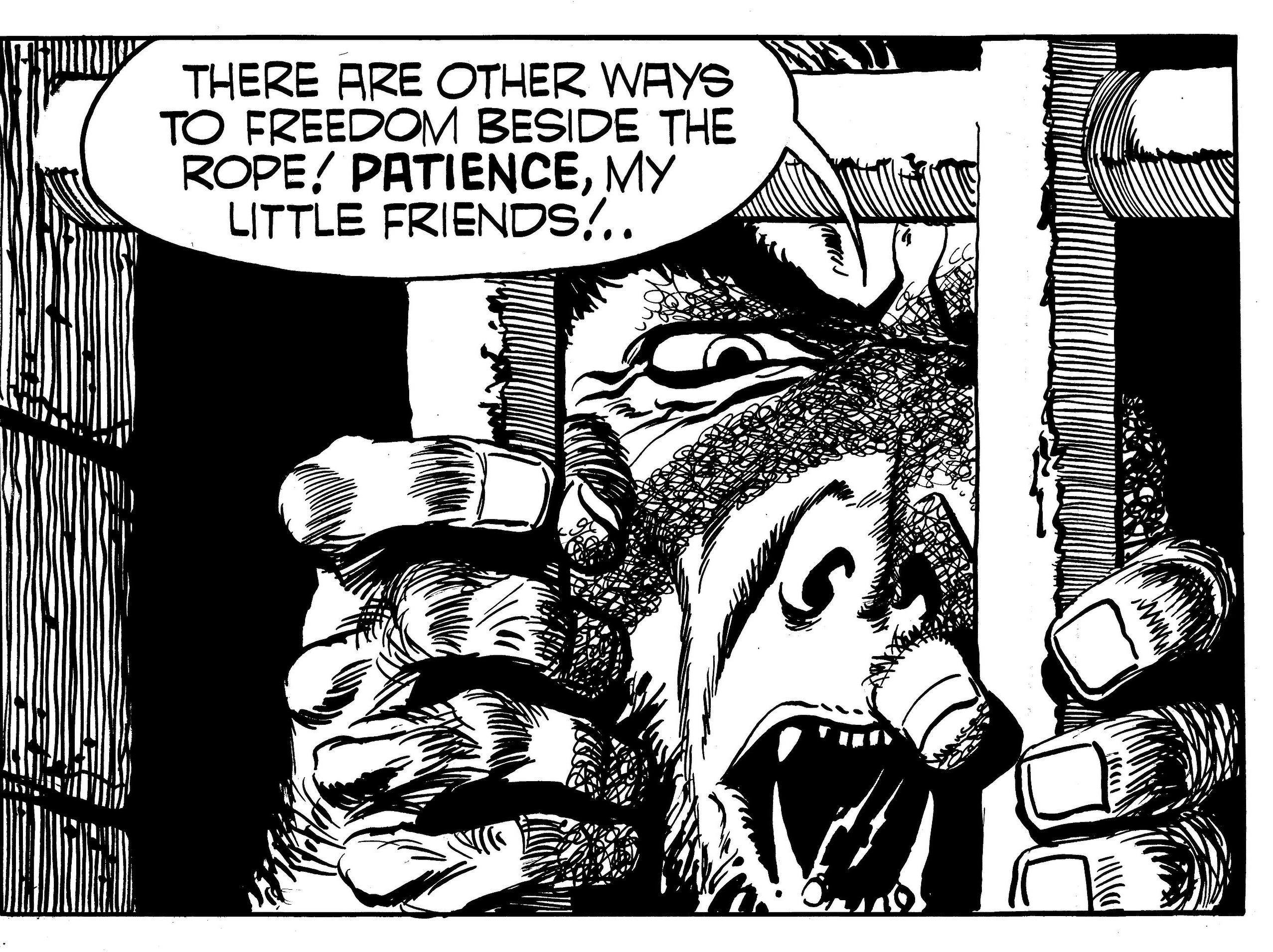
"Tiger face" by Frank Bellamy

A previous post, "Frank Bellamy at Kettering Exhibition ended", includes a photograph of a word-balloon wall plaque inscribed 'Fine Art vs COMIC Art' and Norman's comment: "I enjoyed seeing the placement of oil paintings from the Alfred East collection alongside some comic covers, raising the perennial question of what is 'fine art'."

'Fine Art vs Comic Art'.  Result: it's a draw..!

Comics might have had the last laugh, in some cases all the way to the bank, or to a respectable art gallery, which can hold an exhibition of comics art without it being thought funny. But, within living memory, looking back over the not that distant past a very different picture emerges. At one time, Roy Lichtenstein notwithstanding [See David Barsalou's excellent site - Norman], it would be the exception for an art critic to express any appreciation for comics or illustration. It wasn't until I became aware of comics fandom that I even knew I wasn't in a minority of one.

Home Notes (27th July 1951)
"Impatient heart" by Judith Blaney - illustrated by FB

An arts programme piqued my interest a few years ago when commercial art of all types, even the printed versions, was finally, officially, brought in from the cold, as it were, and taken note of as a substantial sub-category of Art: 'Ephemera' - work which by definition is produced with no intention of being kept for posterity. Ephemera would also include highly regarded works from another age such as the Japanese woodblock prints of Hokusai and other masters which were originally sold as transient decorative pieces subject to fashion.

The Society of Strip Illustration was founded with the improvement of the standing of the profession as one of its objectives.The SSI Newsletter of May 1985 includes a quote sent in by me of Milton Schulman, then drama critic of The Standard, in conversation on Radio 4's 'Stop the Week':

"You've got an elitist approach to the art form.  You are basically saying there are certain things like the printed page which give people a more emotional and cultural thrill and impact than other things.  You start off with books and go to poetry, then you go to painting, then you go to opera and to ballet - descending, I'm saying - theatre ... telly ... comic strips". 

Just so we know where we stand...

Neal Adams himself has related how, when he was trying to break into the business, the comic book company men tried to 'save' him by not giving him a job - they wanted him not to waste his talent and to go into something more respectable..!

A young Barry Smith in turn found himself on the receiving end of unappreciative art advice - which he related in an interview but quoted here from memory - a life drawing class tutor noticed that Smith had added a helmet and spear, or suchlike, from his own imagination, and declared that it wasn't drawing, 'it's make-believe!'

Frank Bellamy's figure studies drawn from life models naturally seem, by definition, to belong in the category of fine art.
"Life Study" by Frank Bellamy

The 'set-up' scene, from imagination, reference or arranged props and models, particularly for decorative purposes, however, seems to be made into a contentious issue by not being a record of real life experience as it occurs, viewed directly and rendered on the spot.

In marked contrast, the depiction of imagined scenes never detracted from art establishment approval of favoured historical works of fine art.  There is a similar contradiction in the fine art establishment criticism which makes itself evident in dismissing the work of artists which is viewed as populist. David Shepherd, whose 'Wise Old Elephant' was an unexpected best-selling print on sale in Boots the Chemist, has had to contend with this. Jack Vettriano likewise and more so.  He was even criticised for the fact that his figures for 'The Singing Butler' were derived from the 'Illustrator's Figure Reference Manual'.  A volume also on other bookshelves (mine included) all this entire time without it ever occurring to anyone else to paint 'The Singing Butler' from it - had not Vettriano done so. Critics seem to have taken issue with his stylistic associations with early 20th century film noir posters and pulp covers.  Criticism seems to be that Vettriano's art 'is not contemporary art'.  How could it not be 'contemporary'?  He is painting it now!

Frank Bellamy would no doubt have seen the wry irony of Vettriano's great success and fortune, given Frank's stated lack of sympathy for this type of subject.

Fantasy Advertiser Vol.3 No.50 says:

FB:  I had a commission to do two love story illustrations for Home Notes, a women's magazine.  [...]  I was never cut out to do love strips for the IPC girls' paper.  I'd have a go, but I prefer something with a bit of meat and guts."

In Speakeasy #100 Nancy Bellamy said the same:

"When he first decided to go freelance after we moved down to London in 1949, or even before, he used to draw for Home Notes, and he hated those sort of girlie illustrations, static things which he hated drawing.  It wasn't his cup of tea at all, but he did them for the money.  He wanted to draw something with a bit of guts to it."

Frank Bellamy expressed a personal appreciation for the illustrator Norman Rockwell, and it is easy to see why. In contrast to the left-handed compliment by some fine art aficionado in response to viewing a Rockwell enthusiast's collection: "He sure is a hard worker."

FB collector Bob Monkhouse once gave a talk to a comic convention (engagingly as his real self rather than in his self-acknowledged 'TV persona') and described the reception of comic art by the UK general public as "Pearls before swine!"

This was the era in which Frank Bellamy worked.

But it was changing, even then, and Frank himself was at the forefront in changing it.

Sunday Times Magazine 5 October 1969
Artist posed by David Bellamy

To quote Frank Bellamy in Fantasy Advertiser (FA)   [compiled in this post from various sections of the interview]:

FB: This kind of work has been under-rated for many years.  Throwaway artwork to be looked at and immediately discarded.  This is a viewpoint I strongly disagree with.

FB:  I've always had a great regard for professionalism.  One of the best things that was ever said to me was when I was called a "professional's professional".  And this just underlines what I mean.  I'm a great believer in doing a professional job.

FA:  Surely, people are beginning to see that comic strips can do more than amuse, as can be seen from any of your strips in the Sunday Times Magazine...

FB:  Well, there were no adverse reactions to them ... no-one was turning round and saying, "Good God, what's this...comics strips in the Sunday Times Magazine?"

FB:  I've always liked using the the graphic approach instead of the ordinary comic strip way.  Almost a sort of pictorial journalism.  My work for the Sunday Times Magazine in particular was pictorial journalism.  I used this graphic technique for the juvenile market - though many of Eagle's readers were adults - because I've never believed in drawing down to the reader.  If I was drawing for a seven year old, I'd still be as conscious of what I was doing as if it was a cover for the Radio Times.
Radio Times 29 May 1971

In his BBC 'Edition' interview 30th November 1973 FB says:

"I wanted to bring out the page as a complete page, a spread as a complete spread, to make it a unit in its own right."

A discrete coherent original work of art.

The comic art form has always had more serious appreciation in France where it is acknowledged as "the ninth art". The graphic novel format in Japan found a wide general readership.

The experience of Frank's contemporary, Don Lawrence, contrasted working relatively unappreciated for comparatively unrewarding one-off final payments in this country, as compared with the creative rights, collected volumes of his work, an appreciative audience abroad, and the 2003 award of the Netherlands Knight of the Order of Orange-Nassau.

Possibly the indifference experienced here in Britain was related to the focus on primarily literary English, as opposed to the visual arts heritage; Shakespeare particularly.  Which is a bit of an oddity in itself, given that comic art - the graphic novel - is more of a 'theatrical play' on a page than a novel in type, as such, is.

'But is it art?'

"What is 'fine art'?" was the question, and it has a straightforward answer, which is: "'art for art's sake' rather than for commercial or functional use".  Self-expression.

Which would exclude Michelangelo to name but one.  The Sistine Chapel ceiling can be categorised as commercial illustration, albeit on a grand scale.  As someone once observed, the old masters and their vast commercially orientated studios would have all laughed themselves sick at the very idea of 'art for art's sake'.  As someone else [that's 10cc David - Norman] has put it: "Art for art's sake, money for God's sake."

It's arguable that it isn't a question of what art 'is'.

It's more a question of: 'do I want to look at it?'

The issue of what actually 'is' art was once illustrated by the following comparison.  A pile of bricks in a gallery is art and a pile of bricks in the gutter is just a pile of bricks but a Rembrandt which is lying in the gutter is still a work of art.

Oddly enough, and it is odd, the art world, claims its raison d'etre is being able to 'see past' the pile of bricks - or found objects, abstract colour, dribbles of paint, or whatever (or the material of which any work might be composed) - to perceive the genius of and in art itself.

And yet...

The fine art world for so long remained essentially unable to see past the fact of an original piece of comic art being commercially produced for a mass market juvenile readership.

It is a question of being able to see something which, literally uniquely, only one individual, was not only capable of producing, but it is something which we might have assumed to be beyond anything which any human being was capable of producing.

If the development over time of the unique Frank Bellamy 'look' came as a revelation to his fans it can only be imagined how much more so it came to Frank Bellamy.  His self-appointed task and motivation might well be imagined as answering the question: 'just how good can this be?'

It is self-expression at the service of professional purposes.

In the postscript to 'One Hundred Views of Mount Fuji', Hokusai writes:

"From the age of six, I had a passion for copying the form of things and since the age of fifty I have published many drawings, yet of all I drew by my seventieth year there is nothing worth taking in to account. At seventy-three years I partly understood the structure of animals, birds, insects and fishes, and the life of grasses and plants. And so, at eighty-six I shall progress further; at ninety I shall even further penetrate their secret meaning, and by one hundred I shall perhaps truly have reached the level of the marvellous and divine. When I am one hundred and ten, each dot, each line will possess a life of its own."  - "Gakyō Rōjin Manji" (The Old Man Mad About Art).

To borrow another unrelated quote from the web:

"There are two kinds of geniuses: the ‘ordinary’ and the ‘magicians’. An ordinary genius is a fellow whom you and I would be just as good as, if we were only many times better. There is no mystery as to how his mind works. Once we understand what they’ve done, we feel certain that we, too, could have done it.  It is different with the magicians..."

The 1989 Speakeasy #104 Frank Humphris interview by Alan Woolcombe asked what he thought of the other Eagle artists' work, and he said of Frank Bellamy:

"His draughtsmanship was absolutely fantastic, far beyond the usual standard for cartoons and comics - in fact the word comic doesn't really apply."  

Eagle 13 Aug 1960 Vol.11:33 p.12

=====
The above "Fraser of Africa" strip was reproduced in black & white in the Society of Industrial Artists and Designers Designers in Britain No.6. Many thanks David for such a much better expressed article than I could have done!  David suggested some illustrations to accompany the article. I've added one or two he may not have seen before as a thank you and also I thought I'd add to the debate by showing you the following.


Matador
Tim Barnes sent me this a long time ago. Now why is this fine art and the following an illustration to a story?

"A question of honour" by Henry Casson
from Boy'sWorld Annual 1965 pp116-117

Saturday 1 May 2021

Bellamy Life Studies

Tony Smith, appears in the Frank Bellamy Checklist as he interviewed Frank Bellamy, shortly before Frank died and also published various articles in the Northamptonshire Evening Telegraph. His articles helped keep Frank's name in the limelight - just search for his name on the Articles on Frank page.

Anyway he was inspired by the start of the new series I'm doing based around Alan Davis' findings amongst Frank's studio 'detritus'! I'm so glad the series has prompted such a response. Tony sent me three images by Frank I have never seen before and with Tony's permission I present them here. As Tony explained they are all behind glass and therefore not the best representations of the master's work! But I'm more than happy to spread the love!

Tony added that the middle one is, according to Nancy Bellamy herself, Frank's drawing of her!


Nancy Bellamy kneeling


Saturday 15 August 2015

Frank Bellamy "Life Study" art for auction

UPDATE: Now for auction on eBay, starting at 99p!

This is just a quick note to mention Andrew Urquhart has alerted me to the fact that a 'life study' by Frank Bellamy is up for auction. There are many of these out there as Nancy Bellamy sold several of her husband's studies after his death but it's nice to see others.

Life study by Frank Bellamy

I have written about these previously here and fully expect many others to surface over time. How much are they worth? That's a difficult question, I'll enter the end price below as soon as a I learn what it is.


SUMMARY

  • WHERE?: eBay
  • SELLER:  postmanag2001
  • STARTING PRICE:£0.99
  • ENDING PRICE:  £46.99
  • END DATE: SEPTEMBER 13  2015
  • No of bids:5
==================================

Friday 1 July 2022

The Art of Frank Bellamy - reviewed by David Jackson

ILLUSTRATORS - The Art of Frank Bellamy written by Norman Boyd; design and layout Diego Cordoba; Publisher: Geoff West - London: The Book Palace, 2021
 
A Review by David Jackson.

An early draft of the cover!
 
Frank Bellamy, in the inspirational Fantasy Advertiser (Vol.3 No.50) interview by Dez Skinn and Dave Gibbons, says "This kind of work has been under-rated for many years. Throwaway artwork to be looked at and immediately discarded. This is a viewpoint I strongly disagree with."

Here in book form is the material repudiation of the throwaway.

Which itself was a 'here today - gone tomorrow' outlook derived from its origins in the tomorrow's fish and chip paper newspapers print industry.
And all through the half a century or so since, a book by such a title, or one like it, has been discussed by any and all of those with more than half a chance of making it happen, but without immediate success.

As it says in the Introduction, by Oliver Frey, it's been long overdue.

Though there have been many very fine books of compilations featuring single strip examples of Frank Bellamy artwork in genre overviews, as this new volume's detailed bibliography attests.

And throughout those decades these same guys responsible for this latter publication have been working away tirelessly to bring volume after volume of so much great illustration to us all.

In our enthusiasm for the abilities of great artists, the contribution made by the commissioning editors and publishers who made the existence of the work possible in the first place, is often overlooked.


The first full page image in this collection, acting as a frontispiece, is a singular choice in itself, and in its own way, unique. This is the full page portrait of Sir Winston Churchill (described on p40) which, as the footnote to the image states, appeared on the Eagle back page on the week following the concluding episode of 'The Happy Warrior'. Inexplicably [see below ~Norman] it was omitted - possibly in a simple error - when the picture strip biography was first republished in book form.

This page in its day could be seen as a kind of flag and benchmark signal of intent raised by the artist himself at the conclusion of the first stage of his arrival in the form in which he would be pre-eminent.
The Art of FB -p2
Originally published in Eagle Vol:9:36 (6 Sep 1958)

The very next week following publication of the Churchill portrait page, Bellamy's 'The Shepherd King' began the next stage of his career in comic strips as we have come to know them.

As the Introduction also notes, hitherto, for Swift, the picture strip element of the format was seen as an adjunct to the supplementary blocks of typographical text which explained the action.

And although previously 'Monty Carstairs' was in a comics page format, stylistically it was in the established industry standard for that publication at the time.

Even 'The Happy Warrior' was an example, as FB himself noted, of "non-continuity picture strip".

Its subsequent republication in book form (with special presentation format volumes for the creative team, and for Sir Winston Churchill himself), indicates the level of prestige inherent in the project.

Possibly the economics and sales failed to meet management expectations of the time. Possibly the potential market already had, and substantially had kept, their copies of the weekly instalments in Eagle. Then again, the potential for album book form collection of the comics genre, firstly to the English speaking countries abroad, was there. Or even non-English speaking countries nearer to home, as an educational tool, even, in a primarily visual medium, and with a biographical and recent historical subject as Sir Winston Churchill in the immediate post-war decade.

The potential for single-title book volumes of strips first published in portmanteau weekly instalment comics like Eagle remained unrealised by inherently short-termist publishing.

So 'The Shepherd King' which immediately followed had the same educational or improving ethos depicted in a never-bettered action adventure picture strip format. Again ideally suited, you might think, for a single title book compilation and mass market sales in any English speaking Christian country.
The Art of FB -p43
Originally published in Eagle Vol:9:48 (29 Nov 1958)

That such speculation, with twenty-twenty hindsight, is made obvious by the subsequent story of 'Marco Polo' which Frank Bellamy began but then did not complete, as that kind of stylistic consistency was simply not recognised editorially as a material consideration - and which directly led to all the events which then followed.

ILLUSTRATORS - The Art of Frank Bellamy is a comprehensive overview of the artist's stylistic development and life, fully illustrated with colour reproductions (where so in the original publication), many either mostly unseen since originally published and fully deserving to be known more widely. All of which is the product of so much dedicated research by the author and without which so much of the work presented here for the first time would simply be unknown, even to the dedicated fanbase.

The full colour reproductions are particularly fine in every sense. Especially the selection of large-scale frame details, and previously unpublished sketches, and the full size, almost full original pages, facsimile reproductions from the original art boards.

Page after page of full colour artworks makes up the greater part of this volume, one succeeding another as if to outdo it in demonstrating invention and versatility.

The accompanying text covers the events of the artist's professional and personal life reported in the public domain through the artist himself, colleagues and family members.

The idea that if you personally know something about any subject reported in the media, you will invariably know some reported detail to be mistaken. This has even applied to much of previous, and otherwise excellent, published commentary on this same subject. 
 
In terms of examples of the early days of Frank Bellamy's developing technique, most of us, who first encountered his work later on, fully formed, would be hard put to have identified any of these various 'industry standard' styles (political/sporting newspaper cartoons, romance illustrations, scraperboard), as being the same artist's work at all!

The publishing philosophy context of the contemporary picture strips (not fully comics as such) - in contrast to the material of concern then seen in America - is explained.

On page 32 some might read a seeming contradiction with Frank Bellamy's explanation for his use of stipple gradation that 'a printer cannot water his printing ink' (see p108) - with the use of colour or monochrome greys watered inks by the artist - the former being in relation to black or white newspaper print reproduction, in contrast to the half-tones used in Swift or the monochrome third page of the early 'Thunderbirds' in TV21.

As the numerous examples here show, the identifiable Bellamy style developed week by week. over time, within the genre of his early action-adventure picture strips.

There is a beautifully enlarged stipple and colour frame of Churchill (p38) indicating the precision of the original.

On page 48, continued on page 58, (also see p108) Don Harley and Peter Jackson air some personal opinion of the dot stipple pen and ink technique; examples of which feature in the frame detail enlargement on the cover, and in the state of the art full page Churchill portrait graphic. An application which can also be found in Ronald Smith's 'Teach Yourself To Draw' (1942/1954), if possibly not by the same means. As R. Smith showed in words and examples, the pre-existence of raised-surface technical boards is a more likely origin, from FB’s studio experiences, for the stippling technique. FB's method found limited application among the 'Dan Dare' studio team but subsequently can be seen in the work of many other artists, and also the stipple effect has even been created by special applications in black and white photography.
The Art of FB -p50
Originally published in Eagle Vol:11:1 (2 Jan 1960)

Among the classic original pages included for facsimile reproduction in this volume, are some Bellamy 'Dan Dare' front pages, and of the rather wonderful alien view of the city of Lantor. Author Norman Boyd asks readers to be the judge of the practicality of some of the futuristic designs, reflecting some of the reader reaction at the time, which has been brought to light since, and specifically in relation to some of the schematic forms drawn to the given Eagle editorial revamp brief. And possibly overlooking FB's own words which were not included in the FA #50 interview but appeared in the subsequent reprint in Warrior:

New owner Longacre Press lost no time in commissioning an updated new look for the Eagle masthead and front page, and particularly for 'Dan Dare'.

Frank Bellamy: "They asked me to redesign Dan Dare. The uniforms, space fleet, everything. This meant I had to make sketches of everything before I actually started drawing the strip, but I prefer to do that, anyway. I've always done so, on Fraser, Heros and so on. This let the editor know exactly what everything looked like from the start so he wouldn't get any surprises sprung on him in the middle of an instalment."

Fantasy Advertiser: "Did you have any qualms about re-vamping Frank Hampson's personal creation?"

FB: "Oh, yes. I didn't like doing that. But it was a directive from upstairs - that's what they wanted, and you can only give the client what he wants, so that was it."
Republication of the Fantasy Advertiser interview in Warrior 22 (September 1984), with some variations, included additional art and this extra Q&A:
"Why did you get the directive to revamp the costumes and ships?"

FB: "I think it was just the march of progress. They had tended to look old fashioned, and they wanted to keep ahead of what was happening in Cape Canaveral. At the beginning of EAGLE, everything looked super-futuristic, but the actual real life events were catching up extremely fast. They also wanted a 'new look' to coincide with the facelift the cover was getting. I did lots of drawings of the space fleet which were exploded drawings, showing the cabin areas, undercart, rocket compartment and that, which I'd hoped was also help an author so he wouldn't make the common mistake of having someone stepping from one cabin to another, when they are supposed to be at opposite ends of the ship. I tried to keep a realistic approach. Later, there was an exhibition, I think it was at Charter House School, showing 'the birth of the comic strip', and they used my approach, with my art, preliminary sketches, the script, pencil and ink artwork. The interest was so great that members of the American Air Force would go down, thinking these diagrams of ships were for real."

Laughter
The 'Fraser of Africa' section of the Illustrators volume features some engaging contemporary photos of Frank at his desk and with his collected Africana.

The 'Montgomery of Alamein' graphics and pictorial journalism ‘non-continuity’ picture-strip examples are spectacular widescreen cinemascopic spread format with side-to-side single frames, as used to advantage later in 'Heros the Spartan'.

The example of 'Only the Brave' is again pictorial journalism which faces a facsimile of the original page with its printed page opposite for direct comparison.
Art of FB p.69
The 'Heros the Spartan' pages include a large scale b/w reproduction of a sheathed dagger; one of the historical artefacts FB used as title-decorations in the series. Although it is not possible to tell from a printed reproduction, knowledge of Frank Bellamy's avoidance of process white and other opaque means of creating 'negative space' means that all the clever overlapping white space detail of the dagger must have been allowed for and created in the application of the ink..!

The 'Heros' frame detail enlargements and spectacular double-page spreads includes the American Academy of Comic Book Arts award winning episode, exhibited in New York in 1972. [pp.72-73~Norman]

The 'Ghost World' science fiction series for Boy's World comic, seen in retrospect, looks like an inadvertent job application to draw 'Thunderbirds' for TV21.

In the many examples of 'Thunderbirds' double-page spreads and frame enlargements, it is difficult now to appreciate how technically detailed, novel and convincing these were and are. Authentic looking technical interiors and equipment and the like were noticeably more often than not absent from TV and cinema of the time. Even the drawn explosions, which regularly featured as special effects in Gerry Anderson TV series, were always an identifiably Bellamy trademark, unmatched by his contemporaries.
 
'Garth' and the Apollo 11 Moon Landing are strong black and white works for the readership of Mirror newspapers.
The Art of FB -p138
Close-up of panel in "Garth: Wolfman of Ausensee", originally published in Daily Mirror

The large facsimile frame detail of the Wolf-Man (from 'Garth') is referenced in terms of the cast shadow scribble tonal. A Frank Bellamy technique first tried in Mickey Mouse Weekly 'Monty Carstairs' series. All of which indicates a developing stylistic technique and not one found previously ready-made or in use in other art. The problems of pen and ink which scribble tone solves is firstly the 'antique' appearance of line and hatch/crosshatch - unless an antique look is what is wanted. And this necessity of hatched tones either following the form, or not. Another problem involves the weight of the lines (hatch) and the possibility of their being adjusted later if too light, or then being too fine and too many. These sorts of problems being the wrong ‘look’ for superhero comic books and what to avoid is well demonstrated in ‘How To Draw Comics The Marvel Way’ comparing their normal look for colour comics b/w with more overworked hatching of the same frame and how wrong crosshatch looked in that context.

Any number of examples of mostly full colour illustration commissions for 'The Winged Avenger', some technically experimental rendering of World War One for Look & Learn, Radio Times, Sunday Times and advertising, etc, may prove unfamiliar to even the most informed fans.

This volume draws to a conclusion with a portfolio of naturalistic life class figure studies in pencil and chalk.


Interestingly - at least to me - the final image in the volume is a fine pencil sketch of Robin Hood’s Bay - as I had also sketched the self same scene, from that exact same spot, but in the summer of another year. 
 
~David Jackson
Art of FB p.144: Robin Hood Bay

Thanks to David for his kind words and tying up a lot of what I put in this long overview of Frank Bellamy's life and work. But despite his kindness, errors did creep into the text which I've kept up to date on the page where I first told folks about my magnum opus one year ago!

==============================

Many thanks to David Jackson for providing such a fulsome review. After reading it David Slinn reminded me of a previous conversation which explained the lack of Churchill's portrait - 

The 48 episodes provided convenient signatures of the colour pages [although this meant Frank’s impressive final full-page portrait wasn’t included], with a further 8 black & white pages of editorial and photographs.  From: Downthetubes

 ==============================

The Art of Frank Bellamy can be purchased from Book Palace. Details are:

Authors: Norman Boyd, Oliver Frey (intro)
Artist: Frank Bellamy
Publisher: Book Palace Books, July 2021
Number of pages: 144
Format: Soft Cover; Full Colour illustrations
Size: 9" x 11" (216mm x 280mm)
ISBN: 9781913548087

Sunday 21 May 2017

CENTENARY ARTICLE: Part One: 1920s - 1950s by David Jackson

FRANK BELLAMY - design and technique
Part One: 1920s-1950s

By David Jackson

[Part One] [Part Two] [Part Three] [Part Four] [Part Five]

Imagine some counter-factual alternative reality in which Frank Bellamy had not been born a hundred years ago... Not only would nobody have ever drawn the way he did, no one would have ever known it was even possible to draw like that.

It became his self-appointed self-taught task to find out what the Frank Bellamy 'look' looked like. Which was fortunate for us all because he was the only one capable of doing so...


In the BBC Edition programme 30th November 1973, presenter Barry Askew asked Frank:
BA: "What kind of comics did you grow up on, as a boy?"
FB: "Well the first was Chips, or Rainbow and then gradually getting some of the supplements from the United States, which contained Tarzan and that type of thing. The American comic as you saw in the film, was non-existent in this country. The comics were for little types, eight year olds, five and six year olds."
BA: "Things like Beano and Dandy? I read that one."
FB: "Yes. I'm afraid they didn't affect me at all, I didn't used to read those sort of things."

The Rainbow from a month before Bellamy's birth
14 April 1917 No.166 (Courtesy of Alan Notton's ComicsUK site)
See a larger version of the one 2 weeks later on Lew Stringer's site

Illustrated Chips from when Bellamy was almost 5 years old

No doubt his very first attempts at mark-making with a pencil registered a special place in his heart and mind and those schoolboy artistic efforts would have been interesting to see.

In the early development of a young artist's life it is not at the time possible to know the right course to take, in terms of subject matter or technique, let alone the right contacts to make which will, by absolute chance, be the ones which lead to success.
Frank's early years in illustration and advertising included various try-outs of materials, techniques and subject-matter.
Some of the early 'false starts', which would not lead towards the work for which he would become famous, were portfolio sample pieces to take around the publishers and commercial art studios.

They demonstrated a specialist ability to precisely render hard-edged subjects such as mechanical objects, graphics and lettering, requiring not only an exact sense of design but also a degree of unwavering pen control which is beyond many.

1935, circa. 'South for Sunshine - 'SOUTHERN RAILWAY' poster for an RAAS competition, original artwork in poster paint on hardboard, signed FRANK A. BELLAMY , and with Kettering home address on the reverse (42'' x 27'') as a competition entry, it is believed that this design was not used by the SR. It recently went for an auction hammer price of £200. 

"South for Sunshine" Southern railway poster

Were it not signed, as a whole the work isn't easily identifiable in either materials or technique as the artist's, but all that being said, the confident certainty of the lettering and design graphics is exactly in line with so many other early FB pieces. His hard-edge graphics technique development was ahead of the early figure-work elements until they caught up.

Olivia de Havilland at the El Mirador, Palm Springs

Also, interestingly, if possibly coincidentally, an early photo-shoot print of Olivia de Havilland, was found by chance on the web. The 'SOUTHERN RAILWAY' is not a direct 'copy' of this as such but FB could well have had opportunity to have seen the photograph before producing this early poster. A certain coincidence would be, decades later, FB drawing Olivia de Havilland for Radio Times.

Radio Times 29 May 1971 - 4 June1971, p.12

Olivia de Havilland in The Adventures of Robin Hood  (1938)

It would very much fit with the description in Fantasy Advertiser Vol.3 No.50 of producing cinema front-of-house graphics for Blamire's, his local studio in Kettering. This was a job he'd been peremptorily turned down for until the manager, who also ran an evening art class, saw him drawing and then offered him the job!

FB: "So I started the next day, sweeping up and making tea. I thought I could draw but found I couldn't, seeing all the studio artists work. I spent six years working there - from 16 until I was 22 and called up for the army. During the latter part of my stay at this studio we did an enormous amount of work for local cinemas - point-of-sale advertising poster, coming-next-week lettering with bags of punch and a bit of illustration. Then I used to produce two display boards for the Regal cinema. One display was 17ft long, 6ft high and 5ft deep. I had to paint the background, the figures, the action of whatever the film was about, and so on, on Essex board which was cut out so you had standing cut-out figures of things like Angels with Dirty Faces starring James Cagney and Humphrey Bogart, and films of that time."
1930s Regal Cinema, Kettering

FA: "I should imagine your experience in making movie billboards stood you in good stead for the 'splash' frames in your 'Churchill' strip."

FB: "Yes. I did my own display lettering. I like to do my own lettering wherever possible."

The Wizard 18 July 1925
Artist unknown - but lots of thrilling adventures for an 8 year old!

A subsequent family story was that one day FB had gone back to Blamire's, unexpectedly, having forgotten something or some such, only to find his boss was copying his work...

FA: "What did you enjoy reading as a boy?"
FB: "My reading material had been Wizard, Rover and the pulps. In fact, after being turned down for that first job I went straight across the road to Woolworths and bought a western pulp. All the pulps I read had to be either western or G-Men. So, with that sort of diet, I suppose I was never cut-out to draw girlish sort of strips."
[If we assume Bellamy is right about when he bought a western pulp (and he would have been 16) it might be a UK reprint of an American pulp such as All-Star Western and Frontier Magazine. Well, I had to illustrate it! ~Norman]

All Star Western and Frontier magazine April 1933
Artist Unknown
Scan from the excellent Phil Stephenson-Payne's site

Frank Bellamy was very much finding his way in his early days in terms of technique, subject, materials and everything, some of which, while not finding a usual place as part of 'the day job', would be used for one-offs, character studies, drawing from life and the like.

FB: "But I always have enjoyed drawing - pure and simple drawing, whatever the medium. I don't mind if it's pastels, pencil or ink. It doesn't matter to me as long as it's actually drawing."

Northamptonshire Evening Telegraph,
Wednesday Feb 15 1939, p4
by Frank Bellamy -See article here

1939. The 'ARP Report' by Lance-Corporal Bellamy published in the Northamptonshire Evening Telegraph 15 February consisted of some extremely basic scribbled doodles (instructive for the less-than-no-effort-whatsoever put into them..!) illuminating an allegedly 'factual' printed text 'Report' worthy of 'Dad's Army'..!


"Last Train"? by Frank Bellamy

1946. An early pastel depicts a soldier waiting in a railway station. Unpublished as far as is known. It might have been called "Last Train" which appears in the Kettering & District Art Society Exhibition Catalogue of 25 May -15 June 1946.
1946. Pencil sketches of his son David as a baby, 21 February.

David Bellamy as a baby (dated 21 February 1946)
 1946-1949. FB's black and white possibly brush-line drawing ink technique used in sporting cartoons for Northampton Evening Telegraph's Football Telegraph (aka 'The Pink Un') of the humorous variety in a style used by 'political' newspaper cartoonists of that era - signed FRANK A. BELLAMY.

Northamptonshire Evening Telegraph (Sat 10 April 1948) in Football Telegraph)
"Smacked in the eye by poppies & posh on Monday, Wisbech & brush fought a duel today" [cropped image]

Frank's son David has said that FB used to bring home little 'How-To-Draw' books.
A potential candidate for such a little book (7"x4½") possibly read by FB, based solely on my own reading of it, (with no actual confirmation whatsoever that Frank himself ever in fact set eyes on it), is:  
Teach Yourself to Draw 1942

Teach Yourself to Draw by Ronald Smith, English Universities Press Ltd was first published in 1942 (republished in 1954). [The publishers of Teach Yourself Books also include 'Perspective' and 'Commercial Art' in the series].

The following quotes certain pages (page numbers given) which I could imagine FB possibly noting with interest:

  • p24. "You should also begin collecting together, quite soon, any other natural or fashioned objects, which, because of their form or texture interest you - shells, fir cones - bones, jars, even stones of unusual shape [...] You will see that I have made no mention here of flat "copies" [...] It is essential to see for oneself at first hand; and in future You should draw from real solid things, and these alone".
Bellamy uses props - see also Alan Davis' site

  • p71. Dot stipple tones [possibly by use of a special purpose manufactured raised surface board - made for printing such tones] with an effect similar to that which FB created by hand.
  • p82. "Only draw and keep on drawing"[Also FB's own advice in a letter to another fan... And Frank's own experience];
  • p128. "the most significant and useful folds should be selected for inclusion in your drawing, and the rest ignored". [See Alan Davis' excellent feature on photo references Bellamy used where Davis shows photos in the artwork for Sunday Times - and Nancy bellamy with here back to the artists]
[For more on this Sunday Times article see the full article - Norman]

  • p129. ['dot stipple' effect used for a head.]
  • p130. "You might, indeed, be wise to concentrate for a time on self portraiture - drawing yourself in a mirror. [...] ...Rembrandt...dressing up and disguising himself for the purpose".

FA: "Do you find that you start living the part? When the character snarls, as you draw it, you snarl too?"

FB: "Oh, yes. In fact, some artists keep mirrors at hand and when they want to convey an expression of mood, they put on the expression, look in the mirror and copy their own face."

FA: "Which explains why so many artists often draw themselves into their work."

FB: "That's right. It's not intentional. They just draw the expression on their own face."

  • p140. "Drawing from memory. [...] You must understand the function of anything you draw. If any of its parts are movable you should see how they move and to what purpose. You must be able to make a drawing that looks as though it will work. [...] your drawing should be so self-explanatory that a craftsman might, with no other guide, construct the object represented."

This brings to mind, an FB apology to Dez for drawing a cowboy's belt buckle - on a birthday card - that Frank had, too late, realised 'wouldn't function' [Read more here - Norman]

  • p146. "The most useful photographs are those you take yourself." [Again take a look at Alan Davis' feature]

FB: "And you can only go so far with memory drawing. After that limit, you are just causing yourself a lot of hard work that's absolutely unnecessary."

  • p147. "I advised you, at the end of Chapter 1, not to use flat copies. This chapter [use of a reference file] may seem to contradict that, so it must be emphasised that references are not to be copied, or even, necessarily, adapted, but used rather as a source of information and as a stimulus to memory."

In other words, 'informational' reference would be the specific details of the appearance of some object, which it is necessary to depict accurately, but from another, or in fact any other, angle or viewpoint. As distinct from 'compositional' reference which is directly copied from source into a picture.

References which are recognisably copied freehand, traced, or even adapted, are the 'route one' short-cut in terms of time-saving methods of supplementing whatever natural ability and learning an artist may have. However, there are as many pitfalls of the 'little knowledge can be a dangerous thing' variety; hence the cautions issued about such.

  • p169. "..in a pen and ink drawing light and shade are built up with black lines dots. ticks and scribbles [...] Use of as smooth and white and hard a drawing surface as possible also makes for definition and contrast [...] Altering a drawing by sticking paper patches over mistakes is another dangerous habit..." [The solution to which being CS10 line board].

  • p174. "An illustration is a picture having a bearing upon the text of a book, but it must also be - and this is really more important - a pattern which decorates the page and harmonises with adjacent type. Too great a sense of depth and solidity in an illustration may well destroy rather than decorate the surface of a page. It is better to produce something which is frankly flat and decorative; a pattern of shapes..".

1948-1953. FB describes in Fantasy Advertiser his visit to the capital and interest in seeing a full-blown A1 studio, Norfolk Studios, St Brides Lane, London, resulting in being offered a job and relocating.

FA: "So you came down to London with all these big ideas about Fleet Street art studios. Did they come up to your expectations?"

FB: "Oh, yes. But they went beyond that. They frightened me to death, really. But I'm sure I learned more in six months in a London studio working with specialists than I could have in six years in an art school. I'm convinced of it."

FA: "Do you think your work might have suffered if you'd had any art training?"
FB: "Yes. I think it could have done. I'd have had a lot of my own style and technique taught out of me. I feel the training I gave myself was more use than an academic teaching, that gives you bits of everything - irrespective of what your own specialty may be."
Then he was contacted by International Artists a leading art agency and agreed to being represented for freelance work.

Things were starting to look a lot more interesting... But not just yet..!

TO BE CONTINUED...

~-~-~-~-~-~-~-

All quotations above (except where indicated) are from the most exhaustive Bellamy interview in Fantasy Advertiser Vol.3 No.50 in which Dez Skinn and Dave Gibbons asked the questions