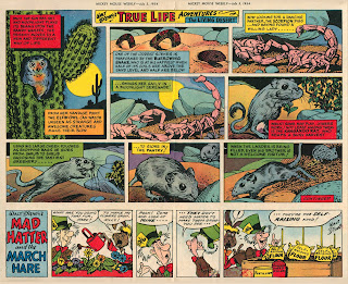
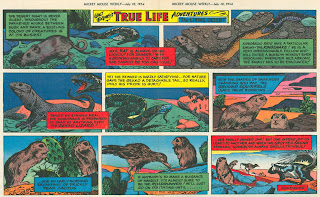
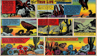
John Wigmans, from the Netherlands, wrote to me a while back about a specific part of Basil Reynolds' and (we think by extension) Frank Bellamy's work in Mickey Mouse Weekly in 1954. John says Basil Reynolds wrote an autobiography of sorts: 'Of Skit and Skat And This And That'. It was published for the first time as a series in 1982/84 in Denis Gifford's ACE newsletter Comic Cuts. The complete story was reprinted in two parts in The Comic Journal (incorporating A.C.E.) issue 28 (Autumn 1994) and issue 29 (Spring 1995). The third time Basil's memoirs were published, was in Walt's People Volume 15 (2014). If you follow the link to Amazon, their "Look Inside" feature allows you to search and read a substantial part of what John mentions.
 |
| Basil Reynolds art from "Beaver Valley", Mickey Mouse Weekly, Aug 22, 1953 |
 |
| Basil Reynolds art from "Beaver Valley", Mickey Mouse Weekly, 1953 (from the collection "Home for Ducks", Vienna, Austria) |
Similarly I had no part in the actual production of the Holiday and Christmas specials, apart from sundry contributions, such as “Skit and Skat.” I imagine that credit for the original idea must go to Silvey Clarke, then the Assistant Editor, aided and abetted by the studio production team, headed by Ibby and Phyllis Thorpe. There was always a tremendous amount of work for the studio to do, especially in the production of colour pages for the weekly.
All the Walt Disney and other syndicated strips used on the four-colour pages were supplied by King Features, in black and white form. These had to be cut, sized up to fit the spaces they were to occupy in the Weekly as well as being pasted onto card. Also, at this stage, the worst Americanisms were removed from the balloons and English words and expressions substituted.
If you're wondering what these Kodak stamps looked like we are in luck. I can't remember where I grabbed this images, but here they are. The books were 6 inches longThese “originals” were then sent to the photographic studio to return as “ghosts,” which were simply black and white prints shot to size on bromide paper. These prints were then pasted onto card, then each strip was hand-coloured in the studio using Kodak transparent watercolour stamps. These were perforated sheets, coated with coloured dyes and were primarily for use in tinting photographic prints. They were sent over from the States or quite often brought over by Bill Levy on frequent trips to his homeland. (I still have some of these books—pre-War vintage and often use them when working on a colour job.) The mounted and coloured strips for each issue were sent off to the printing works with the rest of the artwork but they were NOT used as originals—they were only detailed colour guides for craftsmen at Odhams photogravure works to transform into the finished product. Of course, full-colour artwork originals such as covers were treated as such and reproduced in the normal way. This process of producing colour guides was still operative when I finally left the Weekly in the 1950s. [Emboldening mine and spelling correction mine ~Norman]
John continues:
On his original board Basil wrote lots of instructions for the Odhams' printing works at Watford. He, and I assume Frank [Bellamy] as well, once he had taken over, wrote 'One ghost please' on his original artwork.I asked David Slinn to comment as he was there at the time, more or less, and he replied:
Now the question remains if what was eventually printed on the centrespread of Mickey Mouse Weekly, was really Basil Reynolds' / Frank Bellamy's handiwork. Or is the colouring as published in the weekly indeed done by one of the craftsmen at Odhams photogravure works, as Reynolds described? Even so, BR/FB had to produce the 'detailed colour guides' (=ghosts) first; i.e. the "Living Desert" instalments are still FB's 'first colour strip work'.
Why else would Frank say that 'not only did I draw "Monty Carstairs" in Mickey Mouse, I also got my first colour strip work, Walt Disney's "Living Desert" in the centrespread.' And remember: "This process of producing color guides was still operative when I [BR] finally left the Weekly in the 1950s." Reynolds, the Studio Manager (=art editor) left in February 1956. Prior to that FB had already moved on to Swift in July 1954. But he had had to use this method of colouring while still working for MMW.
Relevant to the comics’ chronology, the following résumés are perhaps in the wrong order. However, explaining the separate procedures, in the context of first-hand experience, makes allowance for any apparent changes implemented since Basil Reynolds’ time on Mickey Mouse Weekly.
[i] As was briefly mentioned, one of my earliest weekly tasks in the mid-1950s was the Ben Day tint colour-guide for Tiger’s cover feature, ‘Roy of the Rovers’. Joe Colquhoun provided black and white line, twice-up, cover artwork and a continuation page (actually the comic’s back-cover); once lettered and titled, the printer’s proof – i.e. reduced in size to that of the comic’s cover – on cartridge stock, was sent back by Tiger editorial.The cover was then appropriately coloured, using watercolours/coloured inks – together with a rough copy, noting team shirts/shorts/socks and other key continuity, retained for succeeding episodes.
Very quickly, I discovered that if you simply painted flat colour, that’s what inevitably appeared in the printed comic; while, even fairly subtle gradations, introduced into a sky area or the grass of the football pitch, would be reproduced quite accurately.So, despite realizing that many of the other Amalgamated Press weeklies appeared quite content with the former treatment – with a keen eye, on a future up the road in Hulton House – I tended to put in a bit more than was probably expected. During a night-time, burning-torch lit search, involving Roy Race and his colleague Blackie Gray, even the fresh foot-prints and flickering shadows on the winter-snow, made it onto the nation’s bookstalls.
Later on, when I had established a freelance association with Eagle and the companion titles, I was also involved with Odhams’ Zip, where the editor John N. Low had initially encouraged me to submit scripts to a series, ‘The Brainy B’s’. This led to Joe and I then being assigned to draw a number of further episodes and, also, work together on some new strip proposals for the title. Zip’s art editor, was a chap called Sandy (his surname, if it was mentioned, failed to register*), and remember being intrigued to find him in the midst of colouring a centre-spread cutaway illustration. I quickly twigged this wasn’t the actual original illustration, but a full-size photoprint of Gordon Davies’ black and white, half-up finished artwork – or a “ghost”, very similar to those John Wigmans has helpfully drawn attention to and invited observations on. [* I fear, Sandy – whoever he was – other than extremely likeable, within the year had joined Norman Williams, Raymond Sheppard and, later, Alan Stranks, in equally tragic circumstances. Being relatively young and in a different world, so to speak, I found this slightly unsettling.]
What follows is intuitive speculation on my part: but maybe, Odhams’ photogravure colour separation procedures, required the “ghost” to be “…hand-coloured…” using a limited number of specified colours – even, restricted, perchance “…to one red, one blue, one yellow, and obviously, the black.” – FB decided to adopt.
Thanks for these additions David
 |
| Original art laid against published art showing size reduction for the published work |
Right now I can shed some new (or additional) light on the 'ghost'-affair. As usual, the answer lies with Ebay where several original drawings by Basil R. from his "True Life Adventures" are being offered. I copied some scans and part of the description of "True Life Adventures - Olympic Elk (part 8 of 8)". This is from March 1954, close to FB's first colour strip work. As can be seen and read in the description, Basil's original drawing measures 41.4cm approx. x 25cm approx. This is board size, so the actual drawing is slightly smaller. Fortunately there is a ruler at the bottom of the images. On the original drawing someone (Basil?) wrote the reduction factor in blue pencil: 10 1/8 inch. I think this is the size for the ghost that Basil mentions: 'simply black and white prints shot to size on bromide paper'. The ruler on the scan with the published instalment gives 10" approx. (print size). Then this ghost had to be coloured [as outlined above ~Norman]
Now the questions are:
- did FB draw his instalments of "The Living Desert" the same size as Basil? (I think he did...)
- Would he have hand-coloured his artwork 'in the studio' or at home?
- Is the colouring on the printed version in MMW by FB himself, or did some craftsman at Odhams use FB's hand-coloured ghost as a detailed colour guide (as Basil described the process)? This means that the printed version is one generation removed from FB's original colouring.
Loving hearing from others, I sent the draft of this article to David Jackson for his thoughts and he gave me some anecdotes on colouring:
One was Jim Steranko instructing the colourist, sorry, colorist that having spent endless time drawing countless Hydra figures in the background he didn't want just a wash of purple (say) over them - he wanted each figure colouring individually. And the colorist said, "I quit!"
The other one is a Tarzan annual where the artist/penciller/inker had drawn Tarzan at night with an ink black sky and tree branches silhouetted against a full moon. But the colourist (not being one and the same as the artist) had completely failed to understand this and had coloured the full moon sky-blue, so that Tarzan now looks like he's crouched at the bottom of a well..!
But to get to the point of this 'ghost' 'indication' colouring. I had never paid enough attention to the Mickey Mouse colour pages to notice that it wasn't usual glossy colour - which we can see it isn't if attention is paid to it. I've never heard the term 'ghost' in connection with four colour 'indication' colouring and would have never associated mechanical colour with anything other than cheap newsprint stock - an anathema to photogravure! I'd never have imagined shelling out on photogravure only to get ostensibly flat limited colour. I'd never thought of photogravure and colour separation in the same procedure / sentence. I actually prefer cheap paper stock old style mechanical flat colour production of American comics to the new ghastly 'digital-airbrush color' that there is these days! It optically conflicts with the actual artist's or artists' (penciller-inker's) linework.David said regarding John's questions above:
- Regarding the size:In all probability, I'd think. The whole process in all aspects of the production of the comic seems rigidly structured.
- Regarding the colouring at home: Probably at home if it needed subtle colour in an original. But the black ink linework was 'drawn for colour' - knowing in advance that it would be coloured. As opposed to "Garth" which was not drawn for colour or intended to be coloured and looks entirely different in its original b/w to how it would have looked if it had been intended to be coloured.
- Regarding the colouring artist: Probably likely. It doesn't look like recognisably FB colouring. Could look and see if the colourists always did a standard thing with colouring the text boxes etc, whoever the artist...
Apropos Basil Reynolds’ eventual departure, during February 1956, from Odhams Press to the nursery titles, Tiny Tots, Playhour Pictures and Jack and Jill. It remains unexplained, where John got hold of the idea this was “...when Mickey Mouse Weekly had been taken over by the Amalgamated Press.” The Walt Disney title continued to be published by Odhams, until the original licensing agreement expired at the end of 1957. As touched on before, possibly becoming aware of this major change on the horizon, Basil opted to leave.
He also added a thought on reading this original article:
The key FB question also seems to have been missed. Was the initial experience, on the Mickey Mouse Weekly ‘The Living Desert’ feature, of having to tackle the required colour-guides involving an interim “ghost” image, responsible for the: “…one red, one blue, one yellow, and obviously, the black…” – technique he then decided to adopt?
These are and never were my words nor conclusions nor ideas. Way back, in October 2007, I already expressed my doubts on Alan Clark's statement about the Amalgamated Press taking over MMW (in his "Dictionary of British Comic Artists, Writers and Editors"). Please refer David to the original post on the ComicsUK-forum (http://comicsuk.co.uk/forum/viewtopic.php?f=127&t=1652). There he can read all about my initial scepticism.
Ten years after the first post, I finally had enough evidence (and confidence) to prove Clark wrong on this point. As I wrote in my last post on this subject: "Every 20 years or so the information became less reliable." I hope the above will clarify matters.
Morning Norman,Having now taken a longer look at the one "Living Desert" that I actually have a copy of and the other two v. large scans noted on the Checklist. I don’t know what the other three look like - apparently FB drew six in all.
Without being too dogmatic about it, to re-use a favourite phrase from a work colleague in the early seventies, there’s no way in the history of cats that Frank Bellamy had a hand in this colouring!
OK then, so for why, you might say. See the 17 July episode. The intensity of the lurid green in the top right frame is in optical competition with the hatching linework. By any logic, it should be, I’d say, pale sky. Or why the lurid yellow in frame one? Or why is the cactus plant between the gila monster and the squirrels two different shades of flat green?
To take the one for 3 July 1954.
As with the other two Noted - FB might well have coloured the last three for all I know, not having seen them - it seems FB did the black linework and technicians did the colouring; maybe because of tight deadlines, or those in-house considered themselves the authority in terms of the technicalities of the process - whatever.
Coincidentally enough, after previously mentioning that Tarzan frame, the first indication, or clue, is the full moon. Is there any way in space or hell Frank Bellamy would either colour, or instruct anyone else to colour this, bright yellow? Never happen! Also take a look at the patch of sky to the right of the second moon - would FB ever have left that like that?
There is no other thought-out thought-through (use of colour) arrangement of lighting.
It is the same story over the whole of the piece, and the other two episodes. If it isn’t the three odd drops of orange on the owl in the first frame, it is the way the colour is applied overall.
The ‘thinking’ at the back of the colour application seems to have been: look for a discrete shape of each form, and colour all of it a different colour to other forms. This is colouring-in-book colouring by someone just colouring it in.
Would FB have coloured the different stones and ground in this way (different colours) in these episodes - when he would KNOW that the sand and the sandstone(s) should (would) be all the same local colour?
I don’t think so...
Cheers!
David.
It is a shame that none of FB's original art for MMW, "Monty Carstairs" and 6 instalments of "Living Desert", have survived...
Many thanks go to John for tracking down this obscure, but fascinating, corner of British comics!


.jpg)

