Part Two: 1950s-1960s
By David Jackson
[Part One] [Part Two] [Part Three] [Part Four] [Part Five]
 |
| Boy's Own Paper April 1952 pp.40-41 |
Probably everyone reading this has a good idea what the Frank Bellamy 'look' looks like. Yet up to the mid 1950s nobody knew this - not even Frank Bellamy.
Drawing - fine art - is considered a difficult enough and praiseworthy talent in its own right - as a sort of human-camera translating the scene before the artist into line and or tone or colour. But, for the illustrator and comics artist there is an added difficulty - there is no such scene to draw from!
It is a task which makes doing a jig-saw without a box lid look like child's play.
Or, put another way, it would be a daunting task for anybody to take a blank sheet of CS10 board and make an exact copy of any illustration, let alone comic page or strip, by Frank Bellamy - even if they were allowed to use tracing paper, never mind 'by eye'...
Frank Bellamy of course had only a script and a blank sheet of paper to start with!
With pen and ink, just controlling the tools and materials is a 'high-wire' performance and always on the edge of a blot, a drip, run, or a slip or skid of the pen, rule or brush.
As Frank said himself in Fantasy Advertiser (Vol.3 No.50):
FB: "So again, no tricks...no easy way. In fact, I consider line drawing to be the most difficult form of drawing, because it is so positive. You can get away with murder with a pencil, but with a pen it isn't quite so easy."
Despite recognizable touches - seen in retrospect - overall his design and style at the mid point of the twentieth century was still to form. It was a work in progress - FB himself not then knowing what unique and distinctive originality he was developing towards; with his signature technique of pen and ink line-and-key-black with transparent waterproof ink colour washes still in his future...Two early, probably on-spec, portfolio sample try-outs (which were rescued by Alan Davis and are among early FB work on his own website) are mock-up book illustrations with what would be the printed text of a published novel represented by ruled lines, and featuring hand-drawn decorative title lettering: Treasure Island (despite FB's subsequent comments quoted below) and Colorado by William MacLeod Raine (a novel first published in 1928 and since reviewed on the web: "This book out-Westerns Westerns!").

The art materials FB was using at this time included opaque colour, on one occasion for his signature on a dark red ground. For whatever reason (and a job is a job) between 1950 and 1954, the International Artists agency found or assigned freelance romance story commissions from women's interest Home Notes magazine and other similar work, which were not at all Frank's preferred subject - as much due to the relatively static nature of the scenes to be illustrated as the romantic content of the stories.
 |
| Home Notes 27 July 1951 |
The figurework looks to have been drawn freehand and probably posed by Nancy and Frank.
Theoretically it may be possible to photograph posed scenes and trace-off or project these for the finished rendering, but meeting set deadlines of the day may not allow time for this.
FA: "When drawing characters or machines, do you prefer to draw from life or from photographs?"In theory, the advantages of a photograph is in its accuracy. Its limitations then being that the camera can only photograph what exists to be photographed. As a source of information, found reference of any three dimensional scene is reduced to two dimensions so that the true relationship between objects may not be correctly seen or understood, or outright misleading to the viewer (the family snapshot showing a lamppost apparently attached to the head of a relative being only an extreme and well understood example).
FB: "The only time I'd use a photograph would be for convenience sake..."
FA: "...You can't get an elephant into the studio."
Such difficulties need to be overcome by the artist.Still today, tracing from photographs, and it's computerised equivalent, is a subject in dispute. It is a very nuanced issue and, as with anything else about art, it is easier in some way to go wrong despite it being possible to know how to get it exactly right.
 |
| BBC Children's Hour Annual [1952] Page 80 |
1952: The illustrations for the Children's Hour story "I'm proud of my father" are strong b/w inkwork, in a 1940's style of the era depicted, and in design terms with speed line hatching tones.
The March and April Boy's Own Paper credit: SCRAPERBOARD ILLUSTRATION BY BELLAMY. Other editions featuring various genre illustrations in other media and techniques continued into the following year.
 |
| Boy's Own Paper September 1953 |
1953
Frank Bellamy carried out a number of commissions for Odhams Press - with more East African themed subjects (including a cover featuring a rhino) for Boy's Own Paper. At one time, presumably in the early days, being unsatisfied with a work in progress, Frank had said to his son, David, 'I wish I could draw horses!'
To which my sentiment on hearing this decades later was: 'I wish I could draw horses like he couldn't draw horses!'
FB could have traced from a photograph but what he could have meant was, he'd wanted to understand - internalise - what horses looked like - so well as to not need to.
Of course, until the invention of the camera nobody could see how horses were actually galloping at full speed.If it appears that FB was taking the long and difficult route rather than the obvious easy short-cut, the comparison is one of ends and means; it is the difference between someone copying, by sight, writing which they themselves are unable to read, as opposed to someone who has learned how to read and able to write whatever is required, off-the-cuff, without copying. The aim is authorship. Fluency. Consistency. And the articulated solid-geometry which was a distinguishing characteristic of his ability and work.
Comprehensive knowledge is needed in creating scenes which never existed in real life to make all the assembled component parts of a constructed image both fit the dynamic 'flow' of the overall design and be at the appropriate angle, perspective, lighting, etc, in terms of realism.
In comic strips, more so than in other forms of representational art and illustration, the artist is required to take responsibility for conveying to the reader some of the information which in other literary formats would be described in the text. And so drawn details in the art which are there to carry the story must be sufficiently realistic to be 'readable' and clearly decipherable as opposed to merely decorative or impressionistic. Even a 'still frame' photo from an action sequence from a movie - in which, when shown in a cinema, everything looks perfectly realistic, whole and solid - can be reduced to indecipherable blurs in the elements which were moving fastest . Comic strip frames, in their classic form, generally combine both storytelling detail and action in the same shot.
 |
| From Eagle Vol 3 No 11 |
The first FB work in a strip-art form was in fact a series of advertisements, 'Commando Gibbs v Dragon Decay' printed in Eagle Vol.3. Despite being no easy task to spot the Frank Bellamy 'look' - had we not known that it was -this prefigured some sort of turning-point towards action adventure picture-strip art. Onward and upward incremental developments arrived in weekly instalments from here on in!
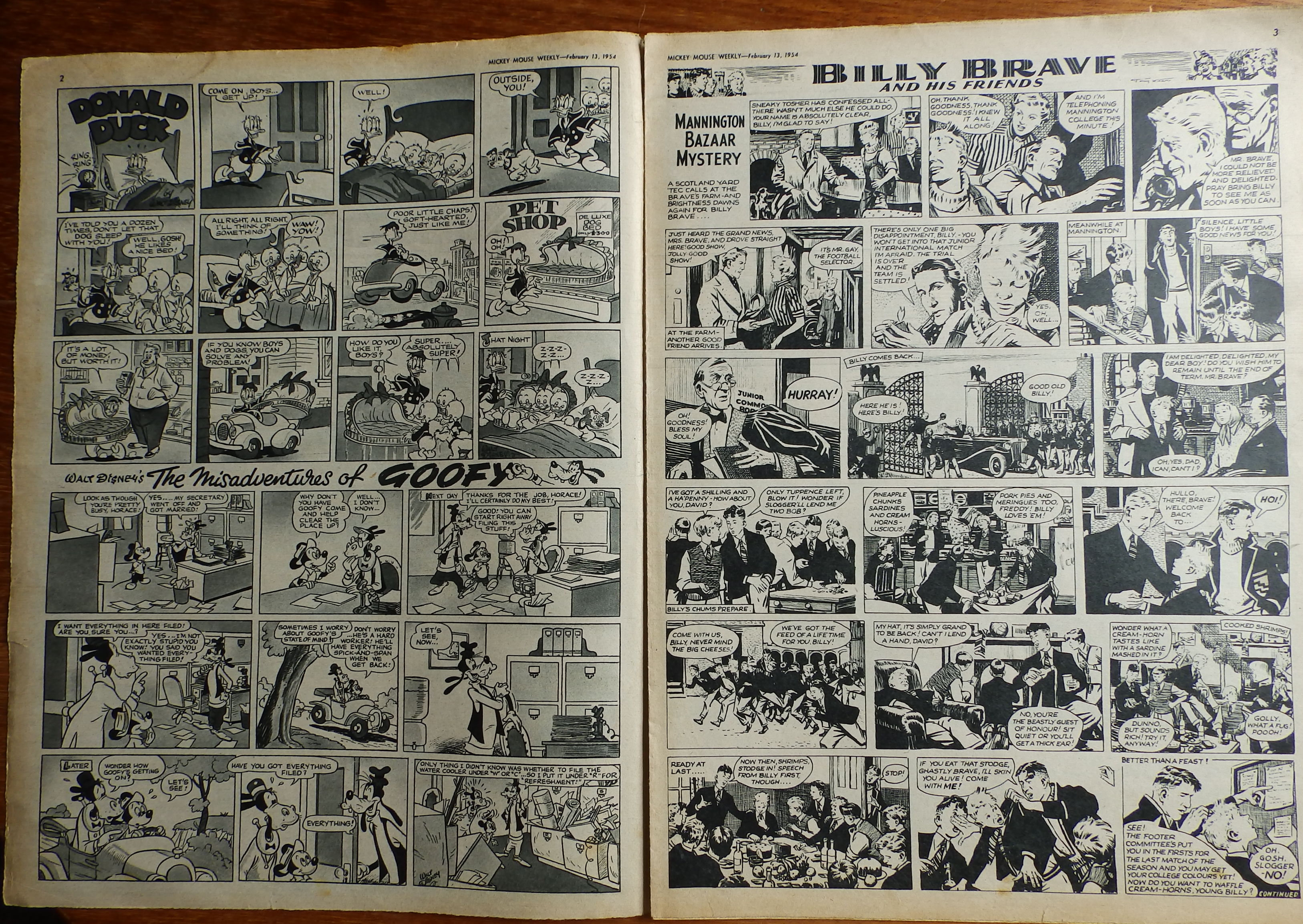
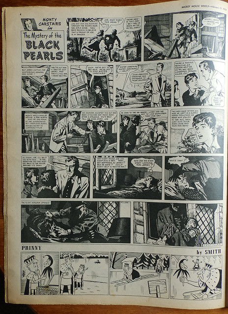
FA: "And when did you actually get started drawing comic strips?"FB's breakthrough as a freelance b/w pen and ink continuity picture-strip artist was a detective series for Odhams Press - taking over from Kenneth Brookes - Monty Carstairs in a "Great New Holiday Mystery-Adventure" 'The Secret of the Sands' in Mickey Mouse Weekly 25th July 1953.
FB: "Very shortly after I started doing freelance work through International Artists. Apparently they wanted to see me up at Mickey Mouse Weekly. Up until that interview, I had only done one strip, an advertisement for Gibbs toothpaste which appeared in Eagle. They offered me a weekly comic-strip for Mickey Mouse, "Monty Carstairs". So, realising I couldn't draw for Mickey Mouse Weekly and do a staff job at Norfolk Studios, in 1953 I left the studio and became a full-time freelance artist. And I've been drawing strips ever since."
 |
| Mickey Mouse Weekly 25 July 1953 |
A reproduction of FB's first comics page was one of the examples illustrating the interview in Fantasy Advertiser. Not mentioned in that context, Frank's son David had posed for the drawn-from-life figures of the young boy in the story. This page is signed FRANK A. BELLAMY, (as is his last page in the series, but in some issues his surname only) but if this first page had been unsigned, the style is more that of the established form than immediately recognizable as being his. Even the word-balloon shapes are wholly untypical, even though lettered by FB. The banks of panels, in rows one above another, is the standard format for all the strips in the issue and all the b/w adventure strips art and some subject matter is stylistically near-indistinguishable one from another.
1954
Mickey Mouse Weekly also commissioned Frank to draw the colour centrespread natural history feature 'Walt Disney's true life adventures: Living Desert'. [see here and here ~Norman]
Other spot illustrations of wildlife and action adventure subjects were commissioned by Lilliput and Everybody's.In terms of the comic-strip, this year was to be the signal change. Frank breaks the banks of panels format in Mickey Mouse Weekly with a larger central frame in the 13th March issue. All the square and cornered word-balloon shapes go and by the end of April the word-balloon graphics are distinctively his own style.
 |
| Mickey Mouse Weekly 13 March 1954 |
FA: "And after these two strips for Odhams Press, you started work for Swift, which was published by Hulton Press..."
FB: I'd always had a feeling I'd like to get in on the Eagle/Swift/Girl group of comics..."
FA: "These papers were in competition with each other for artists and writers at the time, weren't they?"
FB: "Oh, yes. So, when it became a convenient moment to drop from Odhams, as the Hulton Press people had been making enquiries about me, I moved straight on to Swift, in 1954."
Swift, as a companion junior title to Eagle, featured picture stories with both type-set text commentary below line and wash art, and caps-and-lower-case lettered word-balloons, intended for the younger reader. The house style standard format of the title as a whole was again banks of panels in rows one above another for all the picture stories in the issue and again the b/w adventure strips in both art and some subject matter are stylistically similar one to another.
 |
| Swift 2 October 1954 |
 |
| Swift 9 October 1954 |
"The Swiss Family Robinson" one page b/w picture strip followed from Vol.1 No.30, 9th October.
Progress was one of accumulating sophistication. The episodes are uncredited and unsigned. But the distinctive style is recognizably Bellamy. Frames are small scale, ten or eleven each episode; with detail rendered in coherent graphic precision, albeit within a limiting editorial layout and genre.
FB: "I wasn't too happy on Swiss Family Robinson."
FA: "Why was that?
FB: "I think it was because it wasn't a very elastic script and the fantasy in it wasn't my type of fantasy. Everything was laid down for me and I had no way to improvise."
FA: "So, mainly you didn't like the Robinson set because it was such a famous story in the first place?"
FB: "Exactly. Can you imagine a more difficult task than having to illustrate a famous story? Imagine drawing Treasure Island. Everybody has preconceived ideas of what Long John Silver looks like, so the artist would have no scope whatsoever, and his rendition would be completely different to most people's mental picture of Long John. I've heard it said that one of the worst books to illustrate is, in fact Treasure Island."
 |
| Eagle 4 October 1957 |
Men Only was a small pocket sized publication (later better known when it turned to the 'glamour' market and published by Paul Raymond!) gave Frank work in three issues, black and white illustrations
1955-1956
Outspan magazine commissioned several issues of cover and/or interior text story illustrations ranging from drama, science fiction and wildlife adventure (several, including the 'Timeliner' artwork - prefiguring Apollo 11 moon landing and art - in the October issue, are reproduced in Notes to the Checklist) .
FB: "I also did a lot of story illustrations for Outspan - most of which was set in South Africa and all of those being big game illustrations. I was sticking my neck out a bit, but I've always been interested in big game. I can honestly say I've always been interested in Africa, and still am. So, as I said, you can see I was never cut out to do love strips for the IPC girl's paper. I'd have a go, but I prefer something with a bit of meat and guts."
"The Exiting Adventures of Paul English" was a one page b/w picture strip in Swift was taken over by FB from Vol.2 No.15 to No.30.
 |
| Swift 8 October 1955 |
"King Arthur and his Knights", "Robin Hood and his Merry Men" and "Robin Hood and Maid Marian", b/w picture strips with two pages of five or six larger frames each, continued until Vol.4 No.33 ended the run in 1957; with the episodes from Vol.3 No.44 on signed FRANK BELLAMY
FA: "In those days, the strips you were on had libretto under each frame, so you must have had little continuity from frame to frame...almost acting purely as an illustrator."
FB: "I did try to get as much continuity in as possible. Whereas a lot of my later strips have been separate frames, all totally disconnected... 'Churchill' was an example of that."
FA: "When it came to continuity, a breakdown of action, did you find this very hard to do, or did it come naturally from the start?"
FB: "Well, I must confess, it seemed to come naturally to me because, over the years, even back to the Swift days, when it was a hard format of probably nine frames per page with text at the bottom of each nicely squared-up frame, I always wanted to enlarge upon that format. I didn't like the normal, acceptable form of comic strip work, frame after frame, bank after bank...like so many daily newspaper strips stuck together to make up a page."
TO BE CONTINUED... Part Two of the 1950s - a very productive period for Bellamy
I hope David won't mind me adding an advert - all the Swift strips have been reprinted and are available at Book Palace. I don't get commission but have been given copies for my contributions over the years! ~"Honest" Norman