Monday 7 March 2022

Frank Bellamy and Joe 90

TV21 is my favourite comic! It ended its second run (as TV21 & Joe 90) in 1971. I'd left it a year earlier as the Gerry Anderson-inspiration had been diluted or gone! That's 50 years ago. 

I also ordered the spin-off Joe 90 comic which ran for 34 issues and it wasn't until Alan Davis highlighted the fact, that I realised Frank Bellamy drew TWO covers for Joe 90.

Joe 90 #1 cover by Frank Bellamy

This cover for Joe 90 #1 was -sort of - reprinted in 1994 when a new comic dedicated to Joe 90 was published in 1994. This happened because of the revival of Gerry Anderson's Thunderbirds, Captain Scarlet and Joe 90 which the BBC screened. People as old as me could sit with our children and enjoy it all over again. The Joe 90 revival was a bit of a flop, the comic running for just 7 issues!

Joe 90 #1 (1994) p.15

But these are not the two covers I am referring to. 

Here are the first 8 issues of the original 1969 publication:

Thanks to https://comicvine.gamespot.com

You'll notice that Bellamy drew the first issue cover, but #2, 3, 4, 5 and #7 are drawn by someone else, who, although some credit as being by Harry Lindfield, I'm not convinced, especially as Shaqui Le Vesconte's (now defunct) site stated 'Unknown'. But I'd love to know. 

Summarising the covers, Joe 90 #1 to #5 had drawings and paintings, #6 shows Professor Maclaine and Joe in a photo, #7 painting, #8 photos, #9- 12 paintings and #13 has John Cooper (?) starting the strip on the front page - so flat colour and then #14-#16 paintings and 17 and 18 photos. #19 is same style John Cooper cover. From #20-22 paintings and then we get the single big image by Gerry Haylock through to #26. #27 is a single image painting for "Star Trek" and that continues till #30 when again Haylock does "Land of the Giants" again from #31 through to the end - #34.

Anyway issue 6 had a photographic cover, as did issue 8. However we know that Frank Bellamy drew a cover for issue 8 as Alan Davis saved the Polaroid from Frank Bellamy's studio after helping clear it out.

Unpublished cover for Joe 90 #8 by Frank Bellamy

We see three turbaned men, two with briefcases leaving a palace to a red car, The smaller panel shows in the foreground a turbaned man - seemingly - covering up a body in the undergrowth nearby. 

However looking at the story inside issue 8, it appears maybe the script was changed as the published version begins in London and WIN (World Intelligence Network) not in "Bhunistan" as the above does.Joe impersonates the young prince who is a friend of the West and speaks perfect English. I suspect this story may not be reprinted (or the TV programme not re-broadcast - although search YouTube for "King for a Day" ) in these more 'sensitive' times. Here's the first page for you to get the gist of how different the story became - perhaps why Bellamy's artwork was rejected. 

Joe 90 #8 as published Page 1

As a bonus here's where the cover of #1 of Joe 90 first appeared...in an advert in TV21 #209


Friday 11 February 2022

ORIGINAL ART: Heros and a lot of Garth

'Heros the Spartan' Eagle Vol.16:24 (12 June 1965)

That lovely piece of art is in the latest auction from Compal. It's going for an opening bid £4,050 with an auctioneer's estimate of £4,500 - £5,000!

Let's get the basics out the way. as usual I've listed these below and will update the prices here and on my spreadsheet. The listings are at both Compalcomics and TheSaleroom

HEROS THE SPARTAN (Eagle Vol. 16:24)

This episode comes from the last story that Bellamy drew of Heros the Spartan, in the comic, "The Slave Army". As Malcolm Philips states on the auction page, the block printing has been added - presumably because some was falling off with age and the collector wanted to show it complete:

Heros the Spartan original double-page artwork (1965) painted and signed by Frank Bellamy. From The Eagle Vol. 16, No 24 centre spread, 1965. Matoumin rescues Heros from his prison to help plot revenge on El Raschid but they are caught in El Raschid's trap, Matoumin is stabbed to death and Heros condemned to die in the arena at the hands of his own men... Pelikan inks on board. 28 x 20 ins. The Heros the Spartan title lettering and square text boxes are laser colour editions to complete the look of the artwork and may be removed if required

A scan from the comic
It's lovely to be able to see the original with those expressive faces Bellamy drew. The more I look at Heros, the more it grows on me, especially after realising how dark the comic reproductions were.

GARTH: The Wolfman of Ausensee - F150 and F190

Garth: The Wolfman of Ausensee

These two wonderful episodes from my - I suspect - favourite of Bellamy's Garths have a starting bid of opening bid £400 and an auctioneer's estimate of £450-£550

Garth's 'Wolfman of Ausensee' two original artworks (1972) by Frank Bellamy for The D. Mirror 24.6.'72 and 14.8.'72. Indian ink on board. 21 x 7 ins (2)

I don't think the photo is as clear as it could be as it makes the whole thing look faded but that it very unlikely.  usually the boards behind the ink 'brown' with age before the blacks go. Anyway, if any millionaires out there fancy rewarding me for all my hard work....!

GARTH: The Wreckers - H15 and H35

Garth: The Wreckers

The opening bid £450 seems reasonable to me for two originals - the auctioneer's estimate
is £500-£600 - and which include Garth's disappearing / reappearing girlfriend Andromeda

Garth: 'The Wreckers'. Two original artworks (1974) drawn and signed by Frank Bellamy for The D. Mirror 18.1.'74 and 11.2.'74. Indian ink on board. 21 x 7 ins (2)

GARTH:  The Doomsmen - J131

Garth: The Doomsmen

I always have a look at each image to see what they're like and the design here is lovely. We have Bellamy cross-hatching and 'vignettes' to highlight the action.

Bidding starts at £230 and the lot is described:

Garth: 'Doomsmen'. Original artwork (1975) drawn and signed by Frank Bellamy for the D. Mirror 6.6.'75. Indian ink on board. 21 x 7 ins

GARTH: The Bubble Man - J269

Garth: The Bubble Man

Lastly we have another Garth strip, this time from the Bubble Man story. Bellamy was always good at devising aliens and these moth/ant like creatures are great. Bidding starts at £230 and has already started. It's described thus:

Garth: 'Bubble Man'. Original artwork (1975) drawn and signed by Frank Bellamy for the D. Mirror 14.11.'76. Indian ink on board. 21 x 7 ins


AUCTION SUMMARY
HEROS THE SPARTAN
WHERE?: Compal/Saleroom
STARTING BID: £4,050
ENDING PRICE: £4,150
END DATE: Sunday 27 February 2022

GARTH: The Wolfman of Ausensee - F150 and F190
WHERE?: Compal/Saleroom
STARTING BID: £450
ENDING PRICE: £700
END DATE: Sunday 27 February 2022

GARTH: The Wreckers H15 and H35
WHERE?: Compal/Saleroom
STARTING BID: £450
ENDING PRICE: £540
END DATE: Sunday 27 February 2022

GARTH:  The Doomsmen - J131
WHERE?: Compal/Saleroom
STARTING BID: £230
ENDING PRICE: £310
END DATE: Sunday 27 February 2022

GARTH: The Bubble Man - J269
WHERE?: Compal/Saleroom
STARTING BID: £230
ENDING PRICE: £390
END DATE: Sunday 27 February 2022


Monday 31 January 2022

Frank Bellamy auditions for newspaper strips

What do Leslie Charteris' "The Saint", "Modesty Blaise", "Antony Falloway", "Wes Slade" and "Garth" have in common?

Frank Bellamy drew them all. What? you didn't know? Well, let me explain....

Antony Falloway by Frank Bellamy

ANTONY FALLOWAY (Daily Express) c.Oct 1955

In chronological order, we have a strip which did appear in the Daily Express, in October 1955 just not by Frank Bellamy!  I would guess - and have no evidence -, that the above was a try-out for the newspaper, which for whatever reason was rejected or perhaps merely done for his portfolio! At this point in his career Bellamy was really busy - he was 38 years old and already appearing with "King Arthur and his Knights" in Swift; doing regular illustrations and covers for Boy's Own Paper; and even appearing in the South African weekly Outspan. He also drew a short 4 parter in Everybody's  weekly and went onto a long running "Robin Hood" two page strip in SwiftRead more about Antony Falloway here.


"The Saint" by Frank Bellamy - thanks to Alan Davis

THE SAINT (Daily Express?) c. 1969/1970

On 7 January 1969 Conrad Frost spoke to Bellamy about a newspaper strip project, saying the Beaverbrook Newspapers syndication agency was interested in The Saint. Steve Holland wrote to me that "Conrad Frost was a very prolific writer; he wrote hundreds of romance stories and newspaper columns before switching to comic strips in the 1950s; for twenty years or so he was the writer of the George & Lynne strip in The Sun".

The US version of "The Saint" strip started in September 1948  drawn by Mike Roy, then John Spranger, Bob Lubbers  and finally Doug Wildey ending 13 years after it started, in September 1961. In France they had comic stories which were even reprinted in India, using Roger Moore's version of Simon Templar! 

So in January 1969, Conrad Frost, who knew a thing or two about writing comic strips saw the immense popularity of Roger Moore's portrayal during the Sixties, with no strip produced in this country, and thought this a sure-fire winner. Bellamy's fee would be sixty guineas a week. A year later on 8 January 1970, Frost sent Bellamy an overview script "Meet the Saint". On 12 October 1970, 9 months later, Conrad Frost wrote "finally got a script that pleases Charteris" and it looks to be this that started Bellamy on a prospective regular strip again. However, after drawing these strips for the project, Frost wrote to tell Bellamy in the following month, it was a no-go and - for an unknown reason - might go to another artist! The following year would see Bellamy's brilliant run on "Garth" for the Daily Mirror. (Thanks to Alan Davis for preserving this bit of history)

  
"Wes Slade" by Bellamy

WES SLADE (Daily ) c. 1969

Now this is a bit harder to write about, despite knowing of the top two strips thanks to their owner Alberto. Paul Holder was contacted by John Hill, whom I followed up with and had a lovely conversation in 2015. John told me he was a design consultant to the Daily Mirror and employed Bellamy with Mike Molloy to do the Moon Landing feature.  John loved Bellamy's work in Eagle - "David" and "Churchill" particularly - and therefore tracked him down. "Frank visited the office to be briefed and brought in the "Wes Slade" strips to show them.  It was this that convinced Mike that Frank ought to be doing Garth". John went on that Frank visited with "his lovely wife Nancy" and Bellamy was very unassuming but a genius. He also added as an aside that he was pleased they gave FB work at a time when John thought things "were not going swimmingly" for Frank.

Now as to dates and why Frank drew this, I have no idea especially as George Stokes, a Canadian, drew and wrote "Wes Slade" in the Sunday Express, from 29th January 1961 to, at least, 1979, when Jim Edgar took over the writing chores and in 1980, after Stokes early death at 47, Harry Bishop took over as artist. I presume it was Bellamy's interest in Westerns and the fact he was looking for a regular strip (after coming off TV21) - and thus "things not going swimmingly". According to David Slinn, George Stokes had a dreadful dispute with Inland Revenue for two or three years about his overseas earnings from the Sunday Express which David believes affected his health.


"Modesty Blaise" by Frank Bellamy #2100-2102

MODESTY BLAISE (Evening Standard (London)), 1970

Steve Holland wrote in the Eagle Times (Vol 3:4 (Winter 1990) pp. 33-37 "Frank Hampson and Modesty Blaise") about Frank Hamspon's try out for the Modesty Blaise strip and discovered that Bellamy too, had tried out for the strip. Bellamy was called on when Jim Holdaway "drew the strip until his sudden death in 1970". Bellamy has coded the strips #2100, #2101, #2102 and from a quick search it seems that these would have appeared in the story "The War-Lords of Phoenix" (which eventually ran from 12 January 1970-30 May 1970 #2044-2162), reproduced below. As you can see, for some reason, Bellamy didn't get the gig, instead it went to Enrique Badia Romero (followed by John Burns, Pat Wright and Neville Colvin and then Romero again. 

Romero's "Warlords" Modesty Blaise strip

Nancy Bellamy (Frank's widow) once told Bill Storie "that although he did the Modesty Blaise tryouts (possibly at the request of his agent) Frank wasn't actually all that keen on taking over the strip as he didn't fancy "stepping into a dead man's shoes" as he put it and I think it showed in the art which didn't (imho) show him at his best. The Saint strips were a surprise to me though and they represent his work much better I feel" - Thanks for that Bill. 
 
DOCTOR JANET BROWN?

I speculated that Doctor Janet Brown might also have been a newspaper strip, but I suspect now I was reaching a bit. What do you think? 

Thanks to so many people for preserving and sharing these beautiful missed opportunities! Imagine if Frank Bellamy had started a strip earlier than Garth what we would have got? A long running Western strip? Frank would have loved that!

Thanks to Alan Davis for saving so much from landfill; John Hill for sharing his thoughts and the FOUR strips; Garth Groombridge for help with Modesty Blaise; Steve Holland as usual; Bill Storie (for the quote and Gopherville Argus); David Slinn; Aberto Soares who first made me aware of "Wes Slade". And I mustn't forget Alan Vince who brought the Hampson "Modesty Blaise" and the Bellamy version to Steve Holland's attention.

Tuesday 21 December 2021

GARTH STRIPS ANALYSED: THE CLOUD OF BALTHUS

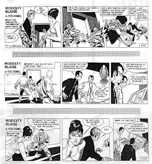
The first episode of "Balthus" Daily Mirror 12 October 1971

In the previous episode of this series, we looked at the first Bellamy-illustrated Garth story, "Sundance" in detail.  This time we are focussing on the second story: "The Cloud of Balthus" which originally ran in Daily Mirror  (12 October 1971 - 27 January 1972 - #E237-F23). I've provided example strips to illustrate some of the points, but if you have access to a copy of the full story, follow along!

I must thank David Jackson and Paul Holder for examining the artwork in such depth and detail in order to outline who drew what in this story. David started the whole procedure and I've created another spreadsheet to show which panels we think are purely Frank Bellamy and which have John Allard's work.

It's at this point I should highlight that the aim of doing this is merely to catalogue what artwork Frank Bellamy did and to show what a collaborative process creating the daily production of the strip was. We merely wish to examine and list what is Bellamy's art and what is Allard's, especially as even Bellamy had trouble explaining what went on. It is an open question how FB and JA's roles were contractually defined Bellamy had to collaborate with others on the Dan Dare strip in Eagle and is on record about the situation being awkward with a jarring of styles within the two pages each week for a year. As we hope to see in later stories there's a consistency of style when Bellamy worked alone on the artwork (as there was on the popular Garth stories drawn solely by Allard, before Bellamy came on board).  

One interesting aspect of examining this story was that I have never seen any episodes come to auction or sale. If you have any idea where these are, I'd love to know. We worked from any versions we could find including the original crudely printed newspaper cuttings! Many times throughout this story David, Paul and I thought we couldn't be definitive without viewing the original boards.

THE CLOUD OF BALTHUS - An overview of the story:

Garth and Professor Lumière holiday in the Caribbean but news comes that NASA has lost contact with not only the orbiting space platform but also the rescue mission. Garth decides to go skin-diving and leave the Americans to it.  Meanwhile a Korean girl, Lee Wan, has been instructed to win over Garth, by whatever means. We learn she is working for Mr Ching and lures Garth to the sea and fires a sedative dart at him before taking him on board Mr. Ching's submarine. His plan is to send Garth to the NASA space platform orbiting the Moon to steal technological secrets. As Lee and Garth explore the outside of the space platform they are being watched by aliens - "Lord Balthus", and other bubble-shaped beings. Garth wants no part of the filming Lee does, but he is sedated again by her and a microfilm hidden in Garth's scalp whilst suddenly the bubble-shaped beings fade into view on the space-platform. Lord Balthus of the Cariads wants to examine this female shape and transports them both across to his ship, where we find the missing astronauts. They are all sent back to earth, after the Cariads destroy the space-platform leaving Garth and Lee Wan aboard the Cariad ship. We learn Balthus has a plan to use them to create new Cariads. Garth discovers sustained vibration affects the Cariads and breaks free, destroying the aliens. On return to Earth in the Cariad ship, they are picked up by a trawler and discover they are world famous. But Garth rightly sees that Mr. Ching will be after them and his agents follow Lumière to Garth's country retreat, where they gas Garth and the Professor. But Lee has proven her loyalty to Garth by helping him destroy the microfilm hidden under his scalp. Garth wakes and chases after the agents, and works with Scotland Yard but Lee has been given an ageing serum to disguise her looks in order to smuggle her back to Mr. Ching. Garth and friends watch the airport, where Garth has suspicions an old lady is Lee. He boards the plane with them, but cannot stop the agents as they threaten to blow up the plane. They force the captain to reduce speed so they can make a parachute jump over the sea. The agent, Lee and Garth are taken abroad Mr. Ching's sub where Lee's good looks are  returned. Garth breaks free from his bonds and overpowers Mr. Ching and takes him and Lee to an escape hatch, while forcing the submarine down. A navy frigate rescues them and Lee and Garth plan their return to the Caribbean to finish their holiday.


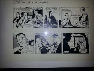
"Garth: The Cloud of Balthus" E237

Interestingly, the opening title strip shows markings on the alien spaceship which do not show up later and John Allard had a hand in adding Letratone to the title strip - which is unusual in the Bellamy Garth run, but as this is the first title strip FB created, perhaps not - as JA and FB are working out who does what at this stage in the run. And where did the name 'Balthus'  come from? Maybe Jim Edgar, the author, liked the name of the French artist?

In going through every panel in this story - with 91 daily strips - it was interesting to see a few runs of strips where we are not sure whether John Allard (JA) did backgrounds. In various places we see that JA has actually taken, or more likely had been given space to draw 19 or 20 complete panels, not just backgrounds. Looking at the jarring changes in style in this story we wondered what was going on. Was it because the first Garth story ('Sundance') being Bellamy's first daily strip was too much and he invested so much in it he was having deadline problems? Perhaps he took "his foot off the accelerator" after "Sundance" to allow John Allard room to move? But it could also be that he was still trying to understand how JA and he should work together on the art. 

John Allard left school at 14 and at 15 submitted samples of his art to the Mirror offices and started work there as an assistant to Steve Dowling a few months before the creation of Garth in July 1943. Until 1969, when "Despite [Dowling's retirement at 65], John Allard recalled that Dowling “let me do some weeks of it entirely by myself – as Steve thought this would help in my obtaining the job of Garth main artist.” He continued the solo art chores from 1969 until Bellamy joined in 12 July 1971 (publication dates). Read the whole Allard interview here

I think there are 23 whole FB strips with no JA amendments / additions out of the 91 strips and the spreadsheet shows they are scattered throughout the story, so it's not just in one place. There are 5 strips with only two panels (most are three - where 'Sundance' had four sometimes) and some are fantastic examples of Bellamy art.

"Garth: The Cloud of Balthus" E240 Panel #3 is likely all John Allard

E238 we see an instance of Allard's Letratone appearing slightly more faint in panel #2. Has he covered some of FB's background art? E240 (above) shows one of the three panels is actually drawn completely by JA - the spaceship. E245 even looks Bellamy-ish in outline but the marks are certainly more Allard-ish with the shark actually having a strangely angled dorsal fin and even the marks on Panel #1's legs appear to be Allard. E247 make us wonder who did what. E251 shows a boat driver resting as Garth chases Lee Wan on the beach. Paul commented "Love the way the guy's boot overhangs the bottom frame of the boat." - breaking the 'fourth wall'! E254 Allard even does the figure work of Garth, Lee Wan and the boat owner. All three are located on the boat, mid-ground, so it's not immediately noticeable as JA. We see, in E255 Mr. Ching watching two skin-divers on his screen, but who drew them? I favour FB, but there has been disagreement between us, could JA have added them as background?. In E258 we see a shadow on the bulkhead, with what appear to be two eyes, but is this FB, or just a printing error? In E264 we have a gorgeous Frank Bellamy spaceship design, very similar to his T-Shirt designs

"Garth: The Cloud of Balthus" E264 a lovely spaceship design

In the context of "thought bubbles", David mentioned these being JA (and "pre-FB looking") but I'd thought surely they are plain and simple JA as he lettered and added all lettering. David replied "The word-balloons/pointer and thought-bubbles/pointers (the outlines) all start to look FB style from his first Sundance strip on - except for these two that I've noticed which are both JA early Sundance frames style". So JA did the lettering - no doubts there, but the shape and placement of the balloons is FB...except in a few places where we think Allard changed them for whatever reason.  

"Garth: The Cloud of Balthus" E266

E266 is a good example of the FB/JA mix. The figures in panel #1 are Bellamy; the star-field is Bellamy-ish; the design of the spaceship is Bellamy. However, who did the shadowing on the spacesuits? It looks like Allard might have done the star-field copying Bellamy's technique but maybe adding his own 'blobs' (on the left) - sight of the original might show process-white added to the black. But FB drew in this way too, elsewhere in this strip (compare the second frame of E284). And the spaceship although a Bellamy design, is filled-in by JA.

As David reminded me, "Very interestingly, at the time FB was drawing (i.e. before) the Apollo 11 Moon landing, nobody knew that the sky as seen from the Moon would be blank - no stars visible..! The evidence wasn't in until they landed. The explanation for the non-visible stars from the daylight surface of the Moon is because the sunlight thrown up from the surface (although made of very dark material in itself) is so strong the human eye shuts right down from the brightness so can't see any stars. The same goes when in close orbit around the Earth and the daylight surface is large in the field of vision. So before the landing it was a scientific debate as to what would turn out to be the case in fact." Here Bellamy drew stars as this is a story, not a factual account.

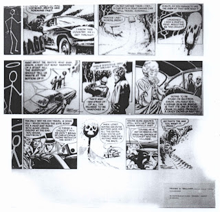
In E270 we see a strange addition of heavy cross-hatching (possibly Letratone) where we are used to seeing light backgrounds. Curiously in E271, the great Lord Balthus appears with two of his minions, and after introducing himself demands that Garth and Lee Wan take off their "hideous garments" and reveal themselves. Anyone reading at the end of 1971 felt they knew they'd see Lee Wan standing naked - well at least topless, but no, they both took off only their outer spacesuits and from that alone Balthus could now tell he had a female of our species! Anyway the first panel is interesting showing FB's figure work and left hand control panel, but JA's additions in the background. Paul and David mentioned this: "White on black cross-hatch b/g tone at top right would be JA. The (slightly not exactly parallel thickness) ‘strut’ or construction support, and the hatched vertical lines of work-surface, and the screens at left in (a bit variable) perspective possibly more JA than FB". You can see how difficult this is!

"Garth: The Cloud of Balthus" E276
There are some lovely Bellamy explosions in this strip and although this one looks like Bellamy's work it appears that maybe FB pencilled and Allard completed the sketch - an unusual instance. In E276 we also see some concentric circles made of white 'dashes' in the alien spaceship to which Garth and Lee have been transported. They add visual interest on a black background but are quite odd. We suspect they are by JA adding process white, but once he'd started it was quite possible FB added some when he needed background interest. It was only when Paul noted that there might be some process white on Balthus himself as an aside, that I looked again and realised that actually Bellamy drew the Cariads with a bit trailing from their 'bubble' shapes. As David commented " such inventive coherent design concepts" 

The next 'controversy' - if discussing artwork we haven't seen in the original format can be called that - was in E281

"Garth: The Cloud of Balthus" E281

Before I say anything, have a close look at panels 1-3. YOU decide who drew what.

Here's an example of where I wondered about that pole that we see in #1 and the other two panels. In the previous episode, Garth stumbles and grabs it, so I infer FB drew it with figure work. Here I wonder if he also added it in #1 but did he draw it in the other panels. David mentioned the ellipsis drawn by JA in #1, the "background curved lines tone does appear to intersect Garth's leg (probably a result of FB leaving folds highlights which JA accidentally drew b/g linework up to)". But I hope you can now see how detailed we looked at this art. Then there's the third panel. FB might possibly have drawn a minimal background leaving the details for JA to fill but we just don't know.  

In E283 we wondered where FB drew and where JA added work. FB did the figure work and the 'near-ground' control panel area operated by Garth. The rest of the background elements look like JA. Then the third panel looks to be JA using FB's star-field and spaceship outline.  E292 shows Garth offering Lee Wan a cup of something and what's interesting is the way she is covered up appears to be rather crude and we wondered if she might have originally been drawn naked. There is little nudity in this strip, as it is, and this (and the following 2 strips) have only one panel in which FB has her holding a sheet/ blanket to cover herself up.

E293 has an interesting, but hardly noticeable 'nick' in the speech balloon. Paul spotted it and said "Could have been put in by JA? At bottom of white panel it does nick into the speech balloon at that point so could have been cut in or placed on top?" Again we have no way of knowing beyond being able to see the original art, but the porthole's perspective is a bit rough.

"Garth: The Cloud of Balthus" E293

One funny aside: I queried with David, what I saw as scruffy lines delineating the clothing, Garth and Lee Wan had on after being pulled from the water. in E295. David replied "This was FB taking tremendous pains to ingeniously depict towelling material sweaters."! And I thought he was being sarcastic - I should have known better! Paul suggested maybe it was added later to cover Lee's nudity. Sight of the original would certainly help here.

In E297 Panel #3 Allard draws a copy of Bellamy's submarine from E257 and again in the third panel of E298, but not so well! E300 opens with a full JA panel and you might remember I uncovered an additional strip in this story from the Daily Record (I called it E300.5) when this was published in Scotland and all three panels were by Allard. In F302 we have an instance of something which turns up in later stories as a technique: FB does his usual 'swirls' in the third panel indicating shadows but also draws parallel diagonal lines underneath (or on top!).

In F7 we see Garth watching some suspicious characters and there are figures in the background existing the airport. Are they JA or FB? I've decided FB but they could well be JA! The story moves onto a plane with Lee Wan kidnapped and Garth watching from further up the plane. In F8 I felt FB left the background to JA here and also in the following strips where the interior of the aeroplane are drawn.  

"Garth: The Cloud of Balthus" F8

In F8, Paul pointed something else out to me which I would never have spotted. When FB took on Garth he expected to do his own word balloons and provide a finished article to the Cartoon Editor of the Daily Mirror. The arrangement with John Allard being around, meant it looked as if Allard was going to do the word balloons, but their positioning would therefore have to be predetermined by one of them.  But who? In 'Sundance' we see FB speech and thought balloons and most of the time it looks like FB does the shapes and placement in 'Balthus', but occasionally we see JA's style here, appearing, as Paul says, to be 'pre-FB balloons'. Compare the F8 #3 thought balloon to the E237, the opening strip, above, for example.  

"Garth: The Cloud of Balthus" F12
Now we get to F12. Again, pause here, blow up the strip above and YOU decide. 

David says: "On balance 'view out of plane door' probably JA (entirely blank white space would still work in reality - of perspective vis-a-vis Garth) but rest of strip could possibly be all FB". And later "I don't think the b/g through the open door look like FB as the scribble tones are none too even in thickness of pen-stroke or integrated tonally; the figures are entirely silhouettes, and one is against the line of the continuous line of the plane hatch (no break in the line); the plane's hatch lock (block of lines tone) doesn't have a stronger nearest edge shadow accent."

Here's what I think: I see #1 there as all FB, (with maybe the exception of the two silhouettes, but to be honest the figures look enough for crude reproduction in a newspaper at a reduced size). Yes the cloud swirls are rougher than usual, but I wouldn't be surprised, looking at this strip - and particularly the ending strips- that FB was either busy (see my concluding paragraph below), rushed, or even ill. Also I felt panel three would be very empty if FB did not fill in the pilot and co-pilot. But those foreground lines under the fist look crude. What do you think? We certainly looked in detail! Then Paul mentioned the background to F16 #1: "Reckon JA did the porthole and the side rivet strip to the right side. Perhaps he even put in the whole panel with porthole behind Garth as it looks a bit plonked in"!
 

"Garth: The Cloud of Balthus" F18

In F20 we see Garth use an oxyacetylene torch to destroy the controls but strangely there are four 'star bursts' represented, so we wondered if JA hand a hand in this - filling in using a copy of FB's first 'star burst'?

"Garth: The Cloud of Balthus" F21 Titan reprint in wrong order!"
+ Garth: The Cloud of Balthus" F22
Now we get F21! Boy, did this cause a lot of miscommunication until something Paul said made me look at the Titan reprint instead of the Menonomee Falls Gazette reprint or The Daily Mirror Book of Garth 1975 (or even the coloured reprints by Martin Baines for the Daily Mirror in Thursday 12 April 2012 - how's that for researching!). If you have the Titan reprint (with the Martin Asbury cover), open it at page 48, strip F21. Why Titan decided to move panel #3 to panel #1 and vice-versa, I have absolutely NO IDEA! Suggestions on a postcard please!

In F22 we see Lee Wan and Garth have a frigate bear down on them and David points out helpfully "Note the rules of perspective make the horizon / 'camera-eye-level viewing this scene' at Garth's eye-level ... but the ship is at least a quarter of the height of the hull (- at the horizon.)..!. If JA hadn't drawn in the b/g sea to the horizon (ie or a horizon either) then the two would have fit (both then been at the same level)" and further "If the scene had been of a very rough sea then there could be a situation where a head - at the top of a huge wave - might be at the same level as half way up a ship's hull - if the ship was down at the bottom of a massive wave trough - (in the same picture). But here in this frame the sea is relatively flat calm so Garth's eye level, at only a few inches above the water, can not be at the same time where the horizon is on the ship (a good fraction of the way up the hull of the ship). The horizon would in fact have to be at the same level as the water on the hull - in this frame therefore out of sight behind the foreground wave at about the level of Garth's chin".  And that's why I'm so grateful to David, being an artist, explaining this stuff.

CONCLUSION

I felt in various places Frank Bellamy and John Allard must have had an agreement where Bellamy concentrated on the figure work and where these are positioned (and also leaving space for word balloons based on experience of having done it himself in lots of comic strips). Then Allard could fill-in backgrounds. But why has Allard drawn so many frames by himself? We know from Alan Davis' discoveries that Allard laid out roughs with lettering completed which Bellamy balked at, as he re-drew some. Perhaps some of this story are the same? However, that still does not explain why.

The strip started publication in October 1971 and Bellamy, at this time, was submitting work to the Radio Times, created several spot B&W illustrations for David Driver, the Art Editor. We know in November 1971 Bellamy was given the brief for the Wilbur & Orville Wright feature which actually appeared in late January 1972 (Before this we see the classic Doctor Who cover published in early January too!). These colours pieces were hard enough, but he also supplied several Doctor Who 'cameos' (and Film Stars) to accompany TV listings, all of which would need reference photos. So I suspect he was working very hard and that led to him leaving space for John Allard to finish artwork and thus we see the mixture of styles I noticed, even as a teenager. This would not be Bellamy's favourite way of working, by any means, but needs must and deadlines were, as he said himself, a religion. It will be interesting to see what we encounter in the next story "The Orb of Trimandias" which on quick examination looks a lot more consistent in style.

Lastly, could anyone tell me what this Chinese writing means, I'd be grateful.  It appears in a few places where Mr. Ching appears. I almost see FB and 41 but maybe I'm being too imaginative!

"Garth: The Cloud of Balthus"E256


MANY THANKS go to David Jackson and Paul Holder (and an anonymous other - you know who you are!) for their support, interest and help. Let us know what YOU think!

Saturday 6 November 2021

ORIGINAL ART: Heros the Spartan, Garth and 2 portraits

'Heros the Spartan' Eagle Vol.16:16 (17 Apr 1965)

GET READY! We have a lot of Frank Bellamy in the latest auction from Compalcomics. The listings are at both Compalcomics and TheSaleroom but for your ease, I have highlighted the Frank Bellamy original art sales below (and to store them for the future!)

Let's start with the headliner, but to be honest there are a few jewels to be had here!

HEROS THE SPARTAN (Eagle Vol. 16:16)

One of few double page spreads that come up at all - and the last one fetched over £7,000 in August 2019. This one comes from Eagle (Volume 16 No. 16 dated 17 April 1965) and as you can see Bellamy has written "Episode 8" on the bottom in his lovely formal writing. It's from the story from 27 February 1965 - 24 July 1965, "The Slave Army" written by Tom Tully. 

The auction description states:

Heros the Spartan original double-page artwork (1965) painted and signed by Frank Bellamy. From the Eagle Vol. 16: No 16 centre spread 1965. Zathran, the Commander of the Black Guard and Heros are tied together in a duel of death…. Pelikan inks on board. 28 x 20 ins. [The 'Heros the Spartan' title and the square text boxes are laser colour additions to complete the look of the artwork and may be removed if required.]
My emboldening. The estimate is £4,500-£5,500 and the starting bid £4,100.

2 PORTRAITS

2 charcoal portraits

The next is an unusual one - a pair of portraits. These were up for auction previously in November 2019 and 'passed' at £230 but this time are offered at the lower starting price of £80 with a reserve. The estimate is £90-£120 which I think is much more realistic. Unfortunately since I first posted the details in 2019 no further information has come forward. This is the auction description:

Frank Bellamy (1940s). Two original charcoal sketches, both signed in capitals 'Frank A Bellamy' probably of his parents. 9 x 12 and 10 x 14 ins (2 sketches)

David Jackson has suggested these might be Bellamy's sister (Eva) and her husband (Stanley Viccars), (who is depicted in the last frame of the the Churchill life story "The Happy Warrior" in Eagle Vol.9 No.24).

Stanley Viccars in "The Happy Warrior"

GARTH: The Women of Galba - G52

Garth: The Women of Galba G52
The first Garth strip offered this time is from "The Women of Galba" story which ran in the Daily Mirror  (27 December 1972 - 10 April 1973 #F304-G86), showing Garth and Narissa about to cross the rope bridge. 

Garth: 'The Women of Galba' original artwork by Frank Bellamy for the D. Mirror 1 March 1973. Indian ink on board. 21 x 17 ins

GARTH: The Mask of Atacama - G201 and G206

Garth: The Mask of Atacama G201 + G206

Some solid drawing and shading in that inimitable Bellamy fashion. Just look at the last panel bottom right!

Garth: 'The Mask of Atacama' two original artworks drawn and signed by Frank Bellamy for the D. Mirror 24/30 August 1973. Indian ink on board. 21 x 17 ins (2)


GARTH:  The Mask of Atacama - Garth-G237

Garth: The Mask of Atacama G237

This single strip from the same story "The Mask of Atacama", which originally ran in the Daily Mirror (13 July 1973 - 25 October 1973 - #G165-G254), sees a strength in Bellamy's artwork. That portrait and shadowing with Bellamy 'swirls' is lovely.

Garth: 'The Mask of Atacama' original artwork drawn and signed by Frank Bellamy for the D. Mirror 5 October 1973. Indian ink on board. 21 x 17 ins

GARTH: The Angels of Hell's Gap - J47 - J48

Garth: The Angels of Hell's Gap - J47 + J48

Here we have two consecutive strips from one of the three Westerns that Bellamy drew in his run on the Garth strip. I love his Western work, there's such a freedom in it, perhaps because he was so confident in that genre and loved Western films, quoting Sergio Leon's movies as inspiration. His favourite film was the 1972 "The Culpepper Cattle Company" which has such a sepia look throughout the film and the dirt shows everywhere. Anyway back to this auction:

Garth: 'Angels of Hell's Gap' two consecutive original artworks by Frank Bellamy for the D. Mirror 27/28 February 1975. 21 x 17 ins (2)

I'll update winning bids below when the auctions are done and add the data to the sales spreadsheet


AUCTION SUMMARY
HEROS THE SPARTAN
WHERE?: Compal/Saleroom
STARTING BID: £4,100
ENDING PRICE: £4,100
END DATE: Sunday 21 November 2021

2 PORTRAITS
WHERE?: Compal/Saleroom
STARTING BID: £80
ENDING PRICE: PASSED
END DATE: Sunday 21 November 2021

GARTH: The Women of Galba - G52
WHERE?: Compal/Saleroom
STARTING BID: £230
ENDING PRICE: PASSED
END DATE: Sunday 21 November 2021

GARTH: The Mask of Atacama - Garth-G201 and G206
WHERE?: Compal/Saleroom
STARTING BID: £450
ENDING PRICE: £450
END DATE: Sunday 21 November 2021

GARTH:  The Mask of Atacama - Garth-G237
WHERE?: Compal/Saleroom
STARTING BID: £230
ENDING PRICE: £230
END DATE: Sunday 21 November 2021

GARTH: The Angels of Hell's Gap - J47 - J48
WHERE?: Compal/Saleroom
STARTING BID: £450
ENDING PRICE: PASSED
END DATE: Sunday 21 November 2021


Monday 4 October 2021

Fans of Frank: Owen Claxton (Part Two) - Frank's highlighting

"Thunderbirds" in TV21 219
White scraped off surface

Frank’s Highlights

Last time Owen Claxton told us about what inspired him in Frank Bellamy's artwork. This time he focuses on one aspect of Frank's technique. I've peppered the article with other examples where I know that Bellamy did NOT use any process white as the original art still exists

OWEN CLAXTON: Being an artist myself I’m always interested in how other artists approach their work and any quirky little tricks or tools they may employ to get certain effects. One aspect of FB’s technique that has intrigued me is how he did highlights without ever resorting to using process white, which is a simple, fast and effective way that many time-pressed illustrators would use. So I thought I would take a closer look. Disclaimer, I don’t have access to any Bellamy originals so this is based purely on viewing printed reproductions. [But lucky for you Norman does!]

"Fraser of Africa" Eagle 27 May 1961 (Vol.12:21)
An example of using ink over white board for highlights

It’s pretty clear that Frank never used process white for painting in highlights, in the Skinn/ Gibbons interview he clearly states that he didn’t like using it. In the same interview he also says the only masking technique he used was a piece of tape for giving a straight edge, no mention of any masking fluid.

In Timeview David Bellamy says his father would begin with a loose sketch in soft pencil without any preparatory work. A loose sketch rather than a tight one suggests to me that the final position of highlights was not decided at this stage. David goes on that Frank would start to ink with a dip pen on top of this loose sketch, building up the picture. 

This stage is where skill comes into play most of all, each pen mark carefully tightening up the initial sketch and providing the structure of the piece. Once this inking stage is over the position of the highlights would be suggested by the ink drawing. I doubt Frank would note their position in pencil as it’s most likely that all pencil would be rubbed out before adding the colour for fear of it showing through the translucent washes. So it must be as the colour inks go on that the final position of highlights is decided. Most of the time an artist can just carefully paint around the highlight with very light washes but there are occasions when this is not always possible. 

Look and Learn #452

If we look at the illustration of French soldiers (page 122 of The Art of Frank Bellamy and above) we can see that the background of fire, explosions and smoke is very loosely painted. However the bits of exploding shell on the left clearly cross over the loose splodges of red and brown ink. If Frank didn’t paint these curving marks over the top with a paler body colour then how did he do it? I can only think of two ways. 

"Montgomery of Alamein" Eagle 14 April 1962 (Vol.13:15)

Firstly while the ink was wet he used a damp cloth or even cotton wool to lift the colour off the board, he would have to work fast to do this to get the ink off before it dried. David Bellamy does state that his father worked at ‘fantastic speed’ and this may well be an approach that Frank used but it’s near impossible to get back to white doing it this way. [see "Montgomery" above ~Norman]

Which brings me to the second way, Frank let the inks dry and then scratched out the highlights with a razor. Now I’ve never used CS10 board but someone who has is Steve McGarry who writes: ‘The china clay surface accepts ink beautifully and mistakes can be scratched out with a razor blade without any feathering, so the art always looks pristine.’ My gut feeling, because I haven’t seen the original artwork, is that Frank used a combination of lifting and scraping to achieve these highlights. If anyone else has any further information or thoughts then I’d be interested to hear them. 


I gave this to David Jackson to have a look and he made some comments:

Some of the early romance - and that era - illustrations [c.1950-1952 ~Norman] have some indications of opaque paint but all later Bellamy art (where it isn't pencil/chalk type) is transparent colour washes of waterproof inks. As Owen has rightly deduced (some of this can be seen in the art) when the washes have completely dried on CS10 board it can be scraped away to the white surface. FB's scraped-back and rubbed-out effects were developed experimentally in black and white line and wash monochrome while still working on Swift. [King Arthur and Robin Hood ~Norman]. 

Thanks David. Paul Holder kindly sent me some of these images in better resolution than produced in the published versions. Looking at the character of Much the Miller in the tree, one can see scraped back elements in the branch, where it forks. 

In the image below that (of the Sheriff of Nottingham) we can see that emphasis has been placed on the gap between the front Norman rider and the one behind, by scraping or sanding the surface of the board. 


"Robin Hood" Swift, 23 June 1956 Panel #4

"Robin Hood" Swift, 23 June 1956Panel #3

And lastly in the two Thunderbirds images below,we see in the Thunderbird 3 image (from TV21 #217) not only white space left blank, but also scraping back to white (to emphasise the circular highlight on the body of TB3) and also the dabbing with cotton wool effect in the spray on the water. But as Paul mentioned, also look at the 'arm' and you'll see a yellow - orange colour in which Bellamy leaves some white for highlight - so confirming what Owen observed.  And in the Jovian Eye (TV21 #152) we can clearly see 'sanding' on the pupil.

 
"Thunderbirds" TV21 #217

"Thunderbirds" TV21 #152

I've always said I'm not an artist and shy from this sort of article which I know is of interest to many following the blog. So I'm very grateful to the above for so much help - Owen for being kind enough to write down the process he deduced; David for further help and thoughts as usual and Paul for most of the images and thoughts. This can not be done without you guys.