First of all let me steer you away from this article if you're looking for the Marvel Superheroes. This is about the 1960s-1970s British TV programme with John Steed and Emma Peel characters.
Secondly a public health warning: You are about to be sucked into a time vortex, losing many hours of your life!
COMIC PANELS USED REVEALED!
Six years ago I took screenshots of all the Bellamy drawings I could find in one episode of The Avengers, called "The Winged Avenger". YouTube has a version here if you have never seen it, but be warned, these copyright materials can disappear as quickly as they are put up.
As a result of my blog article in 2012, Rodney Walker emailed me in 2016, having found at least one of the comics that I mentioned in my article. That's not a sign of how long it takes me to deal with email, just the time to add something a bit more substantial to the blog!
What comic am I talking about? Blackhawk, a DC Comic series (originally published by Quality Comics) and ran from January 1957 - November 1984. The issue that concerns us issue number 223, cover dated August 1966 (on sale in the USA June 1966), pencilled by Dick Dillin and inked by his regular compadre, Charles Cuidera.
The Winged Avenger (31 minutes 51 seconds)
Thanks to Rodney, here's the cover of the comic we know the production team used!
And in the third story "Chuck's Pet Monster" we see this panel:
Blackhawk #223
Blackhawk #223
I rushed out and bought one myself and hunted eagerly for the other picture but as Rodney said to me about the second picture used in the programme:
The other one I can't identify. But from the the Blu-ray, here's the content of the word balloons: "I must do as the masked one commands!" And, "Quickly! Quickly! You have made too much noise! Conceal yourself and leave...quickly!"
The bottom right page number in the white square is "5.".
Good luck with that one.
Cheers,
Rodney
So there's the gauntlet thrown down. Being the stubborn determined person I am, I picked it up and discovered the other comics from DC that were for sale during the same month - thanks to Mike's Amazing World of Comics. I might have followed this line and taken guesses, written on comic forums asking fans of DC but then it struck me. Rodney gave me another clue I hadn't tried, which to be frank seemed far-fetched!
The other, now, identified comic panel!
However, proving, that we should never overlook the obvious, a simple search of the text provided by Rodney led me to finding the image!
Tales to Astonish #84 panel
It was on the Comic Book Resources Marvel Forum - (thanks to "Reviresco"). Sub-Mariner is commanded to smash and bash and 'crrash!' in Tales to Astonish #84 whose cover appears here:
Tales to Astonish #84
BACK COVERS SEEN in "The Winged Avenger"
So the only mystery, if anyone is still awake out there, is the back covers shown on The Avengers. I asked Rodney about whether they appeared on Blackhawk and he replied:
You mean the Aurora slot cars? I noticed something in the Blu-Ray Disc counterpart of that still. It appears to be a thick enough comic that it had the title on the spine. But they covered it up with white material which allows you to know there's writing underneath but without the clarity to make it out. So it was probably an 80-page Giant issue of some DC title.
Unfortunately, I don't have access to the back cover of Blackhawk #223. However, Action #340 came out the same month and it had the Mattel tanks on the back as presumably all DC Comics cover dated August, 1966, did. That would lend support to the conjecture that the other comic they had in Steed's flat was the Blackhawk issue as it has the Mattel tanks ad on back
So I'd bought Blackhawk #223 and lo and behold, on the back cover.....
The back cover of Blackhawk #223
So that leaves us with the Aurora slot cars. I checked Jimmy Olsen #95, the only 80-Page Giant that appeared in June 1966 and that had the same cover as the above, "Switch n go battle set". But as this advert appeared all over the place at that time, here's one from Adventure #341 published February 1966. As Rodney says it's likely to be a Giant but because of the spotty nature of distribution I'm not trying to pin it down exactly.
So how did Rodney find it was Blackhawk in the first place?
"Artist Frank Bellamy, who had made his name drawing the adventures of Dan Dare: Pilot of the Future in the Eagle comic and who was at the time the regular illustrator on the Thunderbirds strip in TV Century 21, was hired to provide several pieces of artwork for 'The Winged Avenger'. These were copied from 35mm frames, and toward the conclusion of events, some clever editing sees the picture on the screen fade into the artwork and vice-versa. Bellamy also provided the artwork for the front of The Winged Avenger comic featured in the episode, which was actually an issue of a DC Comics comic book with a new cover attached. Besides providing artwork, Bellamy also designed both the Winged Avenger costume and the Winged Avenger Enterprises studio set. In order to concentrate on his contributions to the production, Bellamy took a temporary break from the Thunderbirds strip in TV Century 21; the edition published on Saturday 22 October [actually 29 October] saw him temporarily bow out, part-way through the story 'Solar Danger'. He returned several weeks later with a new Thunderbirds strip called 'The Big Freeze'.
"Also seen in the episode are large scans taken of panels from a copy of the DC Comics comic book Blackhawk No. 223, dated August 1966, with newly-drawn giant Winged Avenger images added. However, the style of art indicates that these were not Bellamy's work."
So that's the story of how we finally identified those comic panels and sort of identified the rears of the comic books used)
Whilst on the subject of the Winged Avenger, in the post from 2012 I linked to the website where I stored all the Bellamy artwork from the episode including this logo.
Look above the artist and you'll see the logo
shown at the head of this article
Recently Alan Davis gave me access to the photos he rescued from Frank Bellamy's studio and amongst several interesting pieces were some of this episode including the "Pow", "Splat" and "Bam" artwork which proves these were produced by Bellamy (but the "PING" does not look like his and is missing from the photos - although this is 'arguing from silence'). But more interestingly a close up of the logo seen above as well as this lovely colour image from the programme
The Winged Avenger - Photo courtesy of Alan Davis
Seen at 31 minutes 38 seconds in the episode
.
DISSOLVES TO ARTWORK
David Jackson wrote to David Bellamy in 1977 and Bellamy's son explained:
We were supplied with a transparency and we put this in a projector and blew that up to about imperial size on a piece of board, and traced that off roughly and then he drew the illustration then. Then it was put the other way around in the film.
Thanks for that David (and David!)
FINALLY
Mopping up a few loose ends, I'd recommend "Bully" and his articles on this episode, start here
On the excellent comics annotations site Enjolrasworld we see a mention to the character of the artist in "The Winged Avenger" episode which appears in Alan Moore and Kevin O'Neill's League of Extraordinary Gentlemen "Black Dossier"
The cartoon on the lower left is done in the style of New Yorker cartoons from the 1950s and 1960s. The cartoon’s artist, “Arnie Packer,” is a reference to the “Winged Avenger” episode of the British TV series The Avengers. In “The Winged Avenger” an evil cartoonist named “Arnie Packer” is responsible for a series of murders.
And Ian wrote to me showing me these fan recreations which I thought brilliant, showing the influence of Frank Bellamy still goes on!
And lastly I discovered a tiny replica of the "The Winged Avenger" appeard in the Product Enterprise set in 2002. Anyone got one and tell us that it is literally the cover on a 'book'? "Scoop" answered this on the wonderful Moonbase Central blog - it's a solid object with just the FB artwork on the front!
Through creativity and incremental improvement, over time, Frank Bellamy had originated his unique and distinctive style, from originally when he started out not having it, or knowing what it would be - the 'Frank Bellamy look' not yet then existing - to his work eventually being entirely unmistakable. As the Northampton Chronicle and Echo article "The many faces of Frank" (Thursday 23 September 2004) says: "More than any other British artist he brought a new sense of excitement to the adventure strips of the 1950s and '60s." 1960 Eagle Vol.11 No.32, 6th August introduced the character of 'Martin Fraser' - Fraser of Africa - in the first installment of a trilogy: "Lost Safari" "The Ivory Poachers" and "The Slavers".
After drawing weekly comics pages from 1953 to 1960, culminating in several series for Eagle in full colour, Fraser of Africa represents the full expression of Frank Bellamy at the peak of his powers, free of the developmental compromises he had necessarily negotiated up to this point.
This progress would be one of consolidation and application from then on.
Original art from Eagle Vol: 12:25 24 June 1961
Every mark is exact, controlled, descriptive, explanatory and representational, there to be 'read' and convey solidity, actuality and meaning which informs and repays the attention given to it. Details are not sketchy, generalised or approximate as either pen or brush marks, nor indeterminate, let alone meaningless, tonal areas, but as careful delineation of pattern and light and shade as such detail would be if it had been photographed. In addition to which, there are drawings which are magically better than if they had been photographs - theFraser second episode giraffes are an example (see below).
Eagle 13 August 1960 Vol.11:33 p12
FA: "You then moved on to Fraser of Africa. Had this strip been your idea, you being such a lover of Africa?" FB: "No, I'm afraid it wasn't. The usual thing happened. Someone up at Eagle told me of the idea of an African setting for a new strip and asked if I'd like to draw it." FB: "As well as the artwork, they offered me the script-writing job, but Clifford Makins, then assistant editor, told me it could well prove too much, to draw and write the set."
The scriptwriting was assigned to George Beardmore. "The Ivory Poachers" sequel to "Lost Safari" takes up the trilogy, concluding with "The Slavers", exactly where the first story left off and the hitherto sparing application of full colour is developed further.
FB: "With Fraser, the Eagle people were trying to do something not only entertaining, but also slightly educational - with all the wild animal life and true location. Not like in some strips, in South Africa one minute and suddenly in North Africa the next. I kept it in East Africa, with the local tribes and animals of that region."
FA: "It was on this strip that you took a gamble with sepia predominating the set, most installments being mainly shades of yellow and brown..". FB: "That's right. As I've said, I have this thing about colour. And there was a chance to try a new approach. I thought it would be an ideal strip for a monochromatic look, particularly a sepia look, being in sun-drenched, tawny Africa. But apparently, when the printers heard, they went mad - saying they could never print it. But I was sure it would print. So, I did a series of colour experiments, using the colours I wanted and gave it to them at Bemrose to put under the camera. The results were positive."
FA: "Bemrose was the engraver..." - [The Eagle's long-term printers in Liverpool ~Norman] FB: "Yes. So the same day I handed in a report to Marcus Morris, showing the results of my experiments, and he gave me the go-ahead. The Fraser page was reproduced as a full colour page, but, hopefully, it gave the effect of a sepia page. As the set developed, I put in the occasional full colour frame, purely for impact amongst all the sepia frames." FB: "Fraser is an example of my feeling that there is always room for development in a strip or paper. I like to think that Fraser added a bit more variety to EAGLE."
FA: "It's more than just a matter of drawing what is required, then..." FB: "Yes. I've never classed it as an extension of a hobby. It's not an easy life; it's a very lonely one. But I prefer to be a loner in my work. That's why I didn't like the Dan Dare set-up."
FA: "Looking at you, I see you bear a resemblance to Fraser of Africa. Is this a coincidence, or anything to do, perhaps, with your frustrated boyhood dreams of being a big game hunter?"
'[Uproar of laughter]' FB: "Yes. Probably that's about the nearest I'll ever get to it. Actually, you can sometimes see in an artist's work little bits of his drawings that are offshoots of the artist himself. I've always been a keen fan of the 'spaghetti westerns', and I like to think that, with Fraser we were able to get a near-western look in parts."
Does this look like the gentleman below?
Is Frank Bellamy Martin Fraser?
Wide World Vol. 128 (Jan 1962) pp. 2-3
"The toughest prey" written by Douglas Lockwood
FA: "Looking back over your EAGLE work, it seems you started experimenting with a few new techniques while drawing the Churchill strip. Such as the large black and white frames in the middle of a colour page." FB: "That's part of my thing with colour. I never like to use colour just for the sake of it. As with films, I always think the best are those produced when the director is conscious of the colour, and there's a lack of the super, high-quality Technicolor world. As an example, there's an excellent film called "The Culpepper Cattle Company" [1972]. "Every frame there is like looking through an album of Matthew Brady photographs. They filmed it using colour as it really is. A subdued look, with filthy browns and a suede look about everything."
[This is a hard film to find. Apparently it's on Netflix but hasn't been seen on UK terrestrial TV for at least a decade. I remember it as The Parallax Review says: "The Culpepper Cattle Company is a cinematic curiosity that I’m
not sure has occurred before or since: a coming-of-age revisionist
western. It seems like an odd combination of genres, but it’s not so
surprising, especially considering the time of its making [1972]" ~Norman]
Another cinematic inspiration for the visual appearance of Martin Fraser himself is a very 'Fraser-styled' Frank Sinatra in the movie Never So Few.
As chance would have it, when The Good, the Bad and the Ugly had just been released and its theme was being constantly played on the radio, not only had I not seen the film, I had never seen Fraser of Africa in EAGLE. But what I had come across in the art college library was the Society of Industrial Artists and Designers' Designers in Britain No.6 with a small b/w reproduction of the second Fraser page (posted here last year) and back then I indelibly associated the theme music of that film with this Fraser of Africa image.
David Bellamy, in Timeview, says his father found that playing tapes of film theme music conducive to a dramatic mood.
FA: "If you could draw anything at all, be it an existing strip, a film adaptation or whatever - what would you like to have a go at?" FB: "I'd love to draw the "Dollars" films in strip form. Not just because they were big successes, but because I love 'Spaghetti Westerns'."
Frank recognised in these movies a 'comics look' in angles and lighting. Hence the - presumably uncommissioned and unpublished - out of his own interest, 'Dollars-style' full colour original double-page spread "Hombre" and the stylistically and thematically similar three-page b/w "Swade" which was published in Alley Sloper.
Unpublished "Hombre" strip as seen in photograph of Bellamy in his studio
FA: "Do you do any work for yourself - portraits, landscapes, sculptures..?" FB: "Very little. I used to do quite a bit of artwork to submit to the Society of Graphic Artists, of which I am now a member. But over the last few years I've been doing less and less. Mostly the subjects have been figure work in pastels or drawings, not paintings. I've never done any oil paintings."
FA: "As well as being a member of the Society of Graphic Artists, I believe you are also a fellow of the Society of Industrial Artists. Could you tell us how you achieved that?"
FB: "Well, I sent them lots of samples of my artwork, hoping to be accepted as a member by the Society of Industrial Artists & Design council, and then, quite a few weeks later, I got two letters from them. When I opened the first one, I was very surprised and pleased to find they had accepted my work as being of a high enough standard for me to be accepted as a member. But when I opened the second one, I couldn't believe it, they'd also elected me to immediately become a Fellow of the Society.
FA: "(Editor's Note): Only Frank Bellamy and one other artist have ever been elected for immediate fellowship."
"King Solomon's Mines" art by Frank Bellamy
1962 Following the conclusion of the 'Fraser of Africa' series, FB completed three double-page original centrespreads for an adaptation of 'King Solomon's Mines' but, for whatever reason these remained unpublished. Some have speculated that the similarity of location and themes may have been an editorial consideration. At any event, the next published series also had the similarity of being full colour double-page centrespreads.
The first episode of Montgomery of Alamein written by
Clifford Makins Eagle Vol. 13:10 (10 March 1962)
Montgomery of Alamein.
This second living person picture-strip biography appeared in Eagle from Vol.13 No.10 to No.26, as a full colour double-page spread, with an additional frame occasionally on the front page. In design terms, graphic symbolism features strongly from the first episode and the closing panel comprises of the illustrated frame-word "WAR" (see above). These graphics continue to feature throughout the series and reappear in later work for Radio Times.
FA: "Occasionally, while drawing 'Churchill', you used symbolism instead of realism in your storytelling. Such as the swastika grabbing at Sicily, rather than showing a troop invasion... FB: "I've always liked using the graphic approach instead of the ordinary comic strip way. Almost a sort of pictorial journalism. My work for the Sunday Times Magazine in particular was pictorial journalism. I used this graphic technique for the juvenile market - though many of Eagle's readers were adults - because I've never believed in drawing down to the reader. If I was drawing for a seven year old, I'd still be as conscious of what I was doing as if it was a cover for the Radio Times."
Frames in Vol.13 No.13 further develop the aerial perspective effect (black inking of foreground forms only) which first appeared in "The Happy Warrior".
Eagle 31 March 1962 Vol.13:13 pp8-9
Eagle 30 June 1962 Vol.13:26 pp.10-11
In Edition, Barry Askew says:
BA: "With something again for the EAGLE, like Montgomery of Alamein, there's an interesting example there of the way that you use frames and shapes in different ways." FB: "Well, there again is breaking up this 'square frame, one on top of another' and to bring out important frames. The one in the centre there was just to give a monochrome look to associate with the monochrome films of the second world war."
The same frame also discussed in the Look East programme:
FB: "For instance, there's a job over there, for the old EAGLE, I was rather pleased with the presentation, the whole thing, it went through the editors, all the process engravers, all these various people, seeing this particular work; no-one noticed, other than the readers, when it happened, you'll notice, there's a German infantryman there, firing his rifle, there's a flash from the muzzle, but I'm afraid the bolt is up in the air instead of down. All the readers write in: 'Spot that deliberate little mistake!' - which wasn't so deliberate, it was an absolute mistake on my part. It's bound to happen every now and again."
The signed central frame in Vol.13 No.19 is singled out for special mention in the above TV interview.
Eagle 12 May 1962 Vol.13:19 pp.10-11
I'd speculate that the reason such a 'deliberate mistake' would come about would be due to the black ink line drawing being done at an earlier time from the addition of colour washes (therefore not a continuous train of thought) with the resulting incongruity consequently not noticed.
Such an incongruous impossibility could actually occur in a photograph if entirely coincidentally a flare of light in optical close proximity to a gun barrel made it appear to fire.
It is potentially misleading information like this which is an inherent risk in a reliance on second-hand 'found' reference.
Eagle 22 September 1962 Vol.13:38
(Thanks to David Roach for scans of original art)
Only the Brave.
Vol.13 No.33 - No.38. Single page b/w half-tone wash picture strip, with an extra colour frame on the covers of 33 and 34. Documentary style dramatic reconstructions of real-life events resulting in awards of the George Medal: saving a trapped pilot; fighting-off armed bank-robbers; a lion attack; a runaway ANTAR tank-transporter; PC foils gunsmith robbery; PC who clung on to a recklessly driven car.
The reprint volumes still available from the Book Palace
Heros the Spartan.
Close on the sandaled heels of the big box-office Spartacus in the cinemas, 'Heros' stepped onto the cinemascopic full colour centrespread of Eagle.
FA: "In October, 1962, you started on what must be your best remembered and most acclaimed strip, the two-page colour centrespread for EAGLE...Heros the Spartan." FB: "The EAGLE people phoned to offer me the set, telling me that Heros would be about the swashbuckling adventures of someone who would be a cross between a Roman warrior and an ancient Greek soldier . I had the first script, by Tom Tully, a few days later."
FA: "Could you tell us more about how you started on a Heros instalment, right from receiving the script?" FB: "My usual method would be that I'd read the script through, imagining the words in pictures and noting down 'L', 'M' and 'S' - large, medium and small - by the writer's frame descriptions. That is, as I've said, I would ignore the writer's remarks about close-ups and long shots. Then I can see which are the important frames and which are the fill-ins. There would always be one very large frame that would sum up the whole spread, so I'd put a large cross by that one. Then I'd work out a thumbnail layout. Generally, I'd set it out in banks of three or four frames across. From there it would soon build up around the one or two main frames. Then I'd go straight on to the board, never making roughs."
FA: "One thing I've wondered about, looking at your Heros spreads. When you were composing them, did you ever find the big event of the instalment would fall in an awkward part of the composition - at the bottom corner, or edge, instead of fairly central?" FB: "That could happen. Sometimes I could juggle with the frames a bit, but I was always aware of the composition. I always want the frame at the top left to be compensated by the frame at the bottom right, to balance the whole spread. But that took an awful lot of working out."
FA: "When you'd worked out the frame layout for a Heros spread, would you ink in your frame borders on the drawing board and then fill them in?" FB: "Oh, no. I'd never draw the borders first. I'd probably draw them halfway through the job. You see, sometimes I find a frame can be more effective without a border, vignette shape, and that doesn't happen when you're doing things in pencil."
FB: "One other thing is that when you're actually putting it down on board, a complication comes in - where to put the speech balloons. This is top priority. So, when I've established the rough shape that I want, in the context of the composition of the whole spread, I might discover that the balloons might take up an enormous amount of space. And this would alter the whole composition. So the balloons are the first things which have to be pencilled in with any degree of certainty."
FA: "How many hours of the week, on average, do you think it took to draw a spread?" FB: "It would easily take me a five day week. Sometimes six or seven days. Being fantasy, I didn't have to do all the research I'd needed for sets like "Churchill", but some frames took much longer to draw than others. One extreme example of this was a week when I had a big frame which covered almost the entire spread, surrounded by smaller frames - that particular page was on display, by the way, at the American Academy of Comic Book Arts."
This particular Heros (Vol.14 No.14; 6 April 1963) exhibited in the 1970s at the American Academy of Comic Book Arts helped win FB the AACBA 'Best Foreign Artist' (as seen from America).
EAGLE editor, Bob (L R T) Bartholomew, wrote to FB, 6th March 1963: "I have just seen your last Heros and felt I had to write to say the battle scene was the finest thing I have ever seen in juvenile publications." and Bellamy himself said "I must admit, I thoroughly enjoyed drawing Heros, and if I got the chance, I'd drop everything and start drawing Heros tomorrow."
Eagle 6 April 1963 Vol.14:14
1963-1964
A technology development of particular interest to the illustrator was featured in Eagle Vol.15 No.14 (4th April 1964) - the back page is a full page cutaway of the Polaroid Land camera, which FB will have seen no doubt, even if he did not know of Polaroid before.
Following a b/w drawing illustrating a WWII text story in Boys' World (Vol.No.9, 23 March 1963), FB took over a science-fiction strip series (previously drawn by Frank Langford under the pseudonym "C F Eidlestein")."Brett Million - The Ghost World" began 7th December 1963 in full colour on the back page of Vol.1 No.46, and ran until 25th April 1964, Vol.2 No.17, in Boys' World published by Odhams Press. The publication had undergone a change from a magazine look format to a decidedly more 'Eagle-looking' comic. As science fiction, stylistically, it seems like a way-station between Dan Dare and a job application for TV21.
Boy's World 11 January 1964
[Brett Million and ] The Ghost World
TV21's Alan Fennell had phoned, resulting in a guided tour of the Slough production studios for Frank and Nancy Bellamy with Gerry Anderson himself - as Nancy retold to Jon Johnson in a series for Eagle Times in the mid 1990s (part 15).
Dennis Hooper, art editor of TV21 says (in Strips '78 booklet): "Heros must rate highly ... but this strip ignored two of Frank's greatest gifts. His conception of geometric form and his vision of the future."
FA: "Heros was the last strip you drew for EAGLE before moving over to Century 21 publications, wasn't it?" FB: "Yes. Alan Fennell, the writer of the TV Stingray, Thunderbirds and so on, was the first editor of TV21. He approached me saying he was wanting to start a comic of the same quality as EAGLE, but with the Century 21 look about it, more s-f orientated."
FA: "Did you find it a problem strip - having to draw puppets in an action-packed set?" FB: "Yes, it was a problem. Everybody had seen them on the television, and so they would think of the characters as 18" high puppets, which they were. So I had to decide whether to make them look like the puppets they were, or the people they were supposed to be. I went for forgetting they were puppets, other than simplifying the heads, which had to be recognisable from the established versions on the television."
1966-1969
From a later TV21, July 29 2067 #132 - original art
Thunderbirds began in TV21 spectacularly as a full colour double-page centrespread with a third page in b/w monochrome wash half-tone featuring inspired and innovative technical design invention on a weekly basis.
FA: "When you were drawing Thunderbirds, it started out as a colour centrespread, but soon changed to two separate colour pages, but still in the centre of the comic. Do you have any idea why?" FB: "Yes. The reason they split the spread with a gutter was purely that they could sell two separate pages to the continental market, for reprinting, better than an awkwardly-shaped centrespread."
The odds and scraps salvaged from Frank's studio (see Alan Davis' website) included some 'work-in-progress' photos, one of which being of the submarine rescue from Thunderbirds in TV21 # 241, second page. The photo isn't of sufficiently high-definition to appreciate the art for its own sake but is informative in terms of the order in which the sequence of frames was completed. Which is to say, not in any order which might have been guessed at or expected. The idea that an entire page or spread would have been drawn in pencil, then inked - first linework, then areas of black ink filled in - is confounded here, with completed frames and a partly inked frame and faintly pencilled frames, effectively not drawn at all, all on the same page at the same moment in time. The technique of ruling thick borders around certain frames was not done with any special ruling pen just outlined with 'Gillotts 1950' nibs (or by masking with Sellotape cut with a razor blade) and then filled-in.
Mechanical design innovations not only involved puzzling out the narrative and visual elements into a coherent whole, but also the technical aspects of the various craft which were a feature of the series. These could be existing vehicles from the show or 'one-off use' inventions required to look convincingly functional in order to fulfil a particular role.
FB's own interests were 'historical' over 'futuristic' (despite being able to depict it so convincingly).
He could draw the inside of a top secret space-station like it would be - totally convincing - but, according to his son David, Frank wasn't a mechanically-minded person in terms of being able, for instance, to fix his car..!
FB had sometimes bought construction kits to see how they worked (rather than complete making the model).
Derek Meddings, special effects director and conceptual artist and designer of the Thunderbirds craft, etc says in S.I.G. No.11, 1984: "Thunderbird 2 ... I think that's my favourite, I think it's every artist's favourite, like Frank Bellamy. It was his favourite, he used to draw that thing and he'd really make it look great."
In tandem with Thunderbirds, Frank Bellamy also produced a selection of TV21 front covers of the Captain Scarlet strip and also a colour half page depiction of an astronaut in an advert for Letraset.
Advert that appeared in many comics during late 1969
Once, somehow or other - who knows how - Frank got time off..! Finding himself, at last, on the continent of Africa with his Leica camera he photographed his desert-booted foot on African soil.
FA: "I noticed that for a few weeks another artist was drawing some of the frames in THUNDERBIRDS... FB: "Ah, that was for me to get a holiday. This is the type of job that doesn't give you much time for holidays."
FA: "In fact you have to do twice your normal output one week to have a holiday the next." FB: "Precisely. At one time, I worked for five years without a holiday."
FA: "Do you try to work a normal seven or eight hour day, starting at nine and finishing at five?" FB: "No. I have great discipline about the production of my work but I don't start at a given time and I never hear a whistle blow at five and drop the pen. I've never damaged a nib on that account. I work anytime."
FA: "Is there any particular time of day that you prefer to work?" FB: "No, not really."
Despite which, in his commentary for Timeview, David Bellamy says that frequently working late meant getting up late in the morning and leaving the evening as his favourite time for working, when, as David once said, the phone didn't ring.
FA: "For the John Steed / Diana Rigg Avengers TV series, I believe you did some artwork for one episode..?" FB: "Yes, it was at the time when I was working for TV21. The episode was called The Winged Avenger and was one of those bolt-out-of-the-blue jobs. I went to see the ITV people and they explained that the story was about a strip cartoonist, and they asked me to do the artwork for it. I also designed the costume for the Winged Avenger and the artist's studio." FB: "...But I thoroughly enjoyed my part in it all. One difficult job I set myself was because I suggested they used the technique of holding on close to one of my drawings of the Winged Avenger and then dissolve into live action with the cartoonist in costume. But it was a terrible job to do, because they had to shoot the live action first and then I'd to draw exactly what was happening."
David Bellamy mentioned he possessed thirty Polaroids of the Winged Avenger artwork, in a conversation and he believed only one illustration subsequently remained as original artwork, as at the time, he owned it. (see below) [See all the art used in that episode here ~Norman]
Elma Peem = "Emma Peel". This does not appear in the final cut of
The Avengers episode "The Winged Avenger"
FA: "You also did some work for the Daily Mirror, before you started Garth, I believe?"
FB: Yes. The first job I did for them was a centrespread at the time of, and about, the first moon landing."
The salvaged studio photos of a model lunar lander [see Alan Davis' site], in themselves, have none of the dynamic and nuanced special qualities of the finished drawings, and, whatever visual references of NASA astronauts were provided for this task, again by some inspired means FB brilliantly envisioned and realized what was not there in the reference pictures, and rendered the spacesuits in action on the moon infinitely better than they ever actually looked in real life!
Daily Mirror 11 July 1969 pp14-15
When Anglia TV's Chris Young interviewed him, Frank said:
FB: "This one is pre-the first moon landing. I must tell you it's the first strip I've ever done minus balloons. It would have been lovely to say 'We made it' but it is the first time drawing a strip minus balloons, and in this case for real, because after drawing for years science fiction, seemed funny to draw it actually happening."
CY: "But that was done before the moon landing?" FB: "Before the actual moon landing."
CY: "And were you fairly accurate?" FB: "All the way through, I understand."
CY: "It all came true...ha ha!"
Daily Mirror 11 July 1969 p13
His Apollo 11 moon landing work for the Daily Mirror had, uniquely, no stars in it whatsoever - though drawn before it was established by the actual landing that no stars could be seen from the daylight surface of the moon - I can recall the media prior-speculation as to whether or not stars would in fact be seen - despite the 'ink black' daylight sky there.
Frank would create really black areas of black in all his original art even it meant going over it half a dozen times.
Included among the pieces of studio scraps rescued by Alan Davis was a first attempt version of the lunar lander, abandoned midway, for some reason and left incomplete despite all the work that had already been put into it. As visualized by FB, the blast-off of the LM Ascent Stage, the scene is remarkably prescient as to what it turned out to be in reality when the return launch of a later mission was filmed by the automated camera left on the lunar rover.
FA: "I remember you also did a political cartoon for the Mirror... FB: "That's right, with a long crocodile. I also did one which they rejected, as being too cutting. It's St George and the Dragon, with George McGovern and Richard Nixon. They accepted a re-drawn version of that one."
Daily Mirror 3 July 1972 - Nixon and McGovern
In the late 60s and early 70s, Frank Bellamy began to be commissioned for what at the time might have seemed improbable prospects for comicbook style illustration. It would seem though, that some commissioning editors and art directors had strong memories of being, only a decade or so earlier, comics readers and were still Bellamy fans!
Northampton Chronicle & Echo later quoted Nancy Bellamy: "Frank had so much natural talent and he was a complete perfectionist," she said. "I'm glad so many people still seem interested in his work after all these years – he deserved it."
Frank said in his interview with Look East:
FB: "From the children's comics... into pictorial journalism for The Sunday Times... I mean, I get a telephone call, asking me to draw a cover and three pages in The Sunday Times colour magazine - strip cartoon format..! So I immediately pick myself up, brush myself down... and get on with it. But that approach, and the actual hardware of the job itself is exactly the same as years ago when I was drawing for EAGLE. From The Sunday Times into the Radio Times - "Doctor Who", there's an example, exactly the same, the comic strip format, showing "Doctor Who" for the cover of Radio Times - ten or fifteen years ago, it'd been unheard of."
Sunday Times Magazine 5 October 1969
Artist posed by David Bellamy
The Sunday Times Magazine commissioned a series of comic strip art pictorial journalism features: A young artist "Weary Pilgrimage of Fred Blenkinsop" (5 Oct 69); Playwright's progress (16 Nov 69); Last of the Great Inventions (23 Aug 70; Call the heart squad (13 Sep 70); Jam Today - Supertrafficman! picture strip (11 Oct 1970); A Discreditable Exercise about credit checking (6 Dec 70); Inside Racing (25 Apr 71).
FA: "For those who haven't seen any of your Sunday Times work, could you give a run-down on the type of subjects covered?" FB: "Well, some were about things like the problems of putting on a play at the Royal Court Theatre, heart attacks, the struggling artist, the traffic problem at Charing Cross Road and Centrepoint and so on."
The Sunday Times Magazine front cover posed by Frank's son David as an aspiring artist sitting with his portfolio on a train with a pop art montage above. He also posed talking to Frank and with Nancy in the interior panels.
Some of the reference shots used for some Sunday Times pieces, salvaged by Alan Davis and now on his website, cast light upon the process of creating this artwork.
It is interesting the extent to which this finished art only superficially derives from the source references.
Another piece of artwork rescued from Frank's studio is the part-completed first attempt at the inside horse racing spread, originally titled "Devious Ways to Win". For whatever reason, the published version is entirely unlike the abandoned piece - even the frames illustrating the tactics are completely dissimilar to the original version of same frame. Surprisingly the effort invested by FB in originally creating the frames, including those brought almost to completion, was not saved and recycled (it might be expected that an artist would trace-off such an image and re-use the work). Even a frame which is most closely similar to the previous version is not exactly the same. Rather, they have been, apparently effortlessly or as easily, totally re-imagined and redrawn!
The Winged Avenger by Frank Bellamy (Thanks to Jeff Haythorpe again!)
What do Frank Bellamy and Blackhawk (the DC Comics character from the 60s) have in common? READ ON!
During the four years Bellamy drew Thunderbirds it has been assumed by fans that he only took one break when Don Harley covered Thunderbirds for him during autumn 1966 for six weeks. But as shown below this is one more myth surrounding Bellamy.
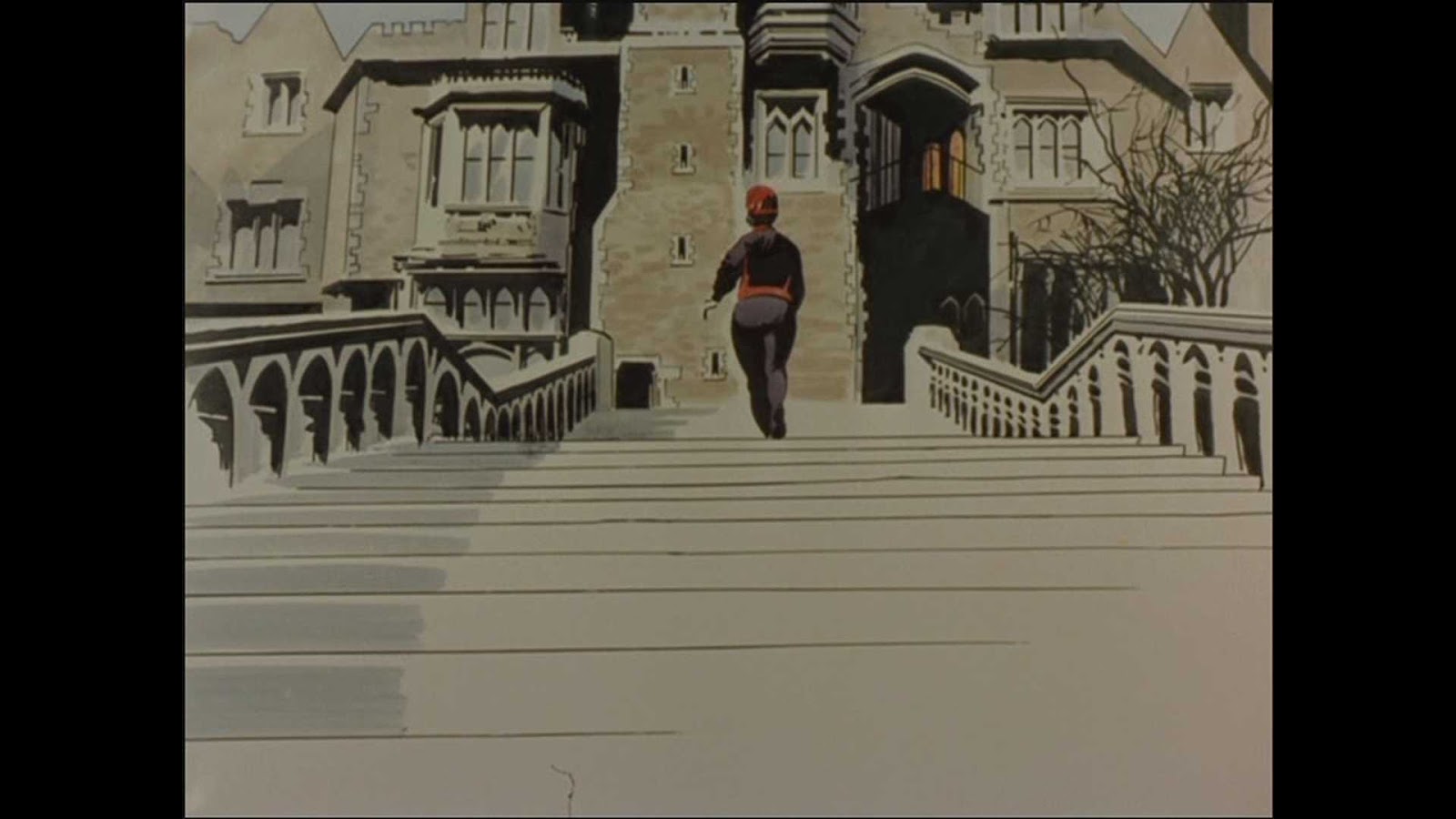
Bellamy was asked, in fact, to contribute to an episode of the highly popular (syndicated in over 90 countries) “The Avengers”. whose best remembered characters were John Steed and Emma Peel. The episode “The Winged Avenger” from the fifth series of the Avengers was filmed around November and December 1966 (see the headline of the paper Steed and Peel reads stating November 30 1966 - it's 29:47 minutes into the programme), and was broadcast or transmitted in February 1967.
Now here's the first connection - Blackhawk. Below are some shots and I would love to see scans of the original comics if anyone has them and can identify them. You have the dates above - but bear in mind the cover dates of DC at that time were apparently the time by which news-stands had to return the comic for credit - and then they would have to have been shipped over to the UK to be bought by the props person for this programme!
Bellamy's design stuck on a DC Comic - Marvel didn't have the Aurora car advert
Meanwhile back to the Avengers.....
The plot of this particular episode contains the usual comedic interplay between John Steed and Emma Peel and far-fetched nonsense that was typical of the enjoyable series. Steed and Peel investigate. the murder of a businessman The episode is fondly remembered and contains such gems as Steed building a cardboard replica of the block of flats (apartment block) in an attempt to guess how the creature had access. It turns out the man-bird did it by magnetic boots which have been invented the eccentric Professor Poole. He sold his boots to Winged Avenger Enterprises, the producers of the eponymous comic books which have been discovered at the scenes of the crimes. The trail leads back to Professor Poole’s Gothic mansion where we see Bellamy’s artwork (as if from a comic book), and then the actual TV scene – implying someone is predicting the murders’ scenes in the comic strip! A fight scene with Mrs Peel and the murderer is aided by Steed who attacks the criminal with Batman-like onomatopoeic panels of art “POW!” “SPLAT!” and “BAM!” For a longer synopsis follow the "Bully: Comics oughta be fun" link
Bellamy was paid well for his 30 colour illustrations, not all of which were in the final cut but sufficient to make this a stand-out episode and Blackhawk comic fans can enjoy spotting their favourite comic character too.
End credits
If you visit Mike Noon's excellent site you'll see mouseovers emulating the TV fades and below is the original art sent to me by Jeff Haythorpe.
The Winged Avenger
Here are the shots I've grabbed from a DVD version.
The Bellamy design stuck to a DC comic
The Winged Avenger logo on his 'shirt'
Headline states November 30 1966
Enlarge to see back of comic
Odd page - ripped from a sketchbook?
Note Winged Avenger logo
Compare this to the picture below
where blood is spattered on this image - this is a bit premature!
Clear view of blood-spattered image on left
- note too the cutout on left and black & white drawing on right.
The latter is blown up at the bottom of this page
Note what appears to be B&W on right
Note Steed looks at panels - not a comic, or comic strip!
This comes from the DC Blackhawk comic #223- see cry of "Hawkaaaa" Read more here
Tales to Astonish #84 shows the Marvel character Sub-Mariner! Read more here
Don't try this address - it doesn't work!
Don't miss the pencil sketch
3 images on wall
Note - image on right appears to be B&W but isn't - see later images
Closer view of background images
Although this is hard to see I do not think this art is Bellamy's
You have to be quick to see pencil sketch on left
Emma is holding a photo over back cover
Back cover is different from later one below
Notice blood-spattered drawing mentioned above!
Steed reads "Elma Peem" but this is not shown -
although this piece is still known to exist - see below
I can't make this picture out
This sound effect is not by Bellamy
Credit where credit is due!
For fun I emulated the Michael Noon site and created gifs of some 'transitional scenes' from my own screen grabs
Emma enters Prof. Poole's establishment
Emma looks around
Professor Poole is attacked
Winged Avenger leaves through window
The Winged Avenger enters by window
Emma is attacked
UPDATE: Versions of this come and go on YouTube so I've linked to a search and will leave you to browse